CORAL


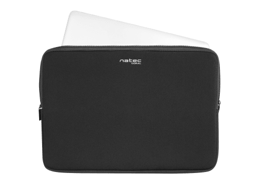
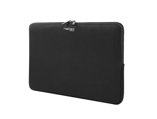
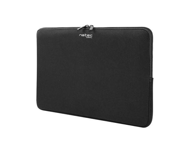

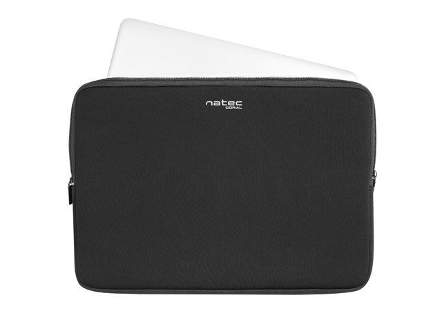
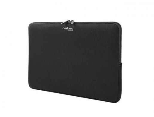
Natec Coral is a durable case made of high-quality materials that will effectively protect your laptop while traveling. The case is available in three sizes, so that each user will find the right size for his device. Natec Coral is suitable for laptops with a screen size of 13.3, 14.1 and 15.6 inches.
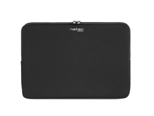
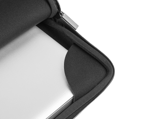
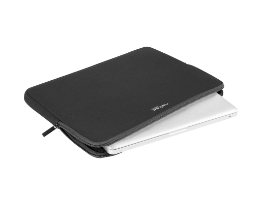
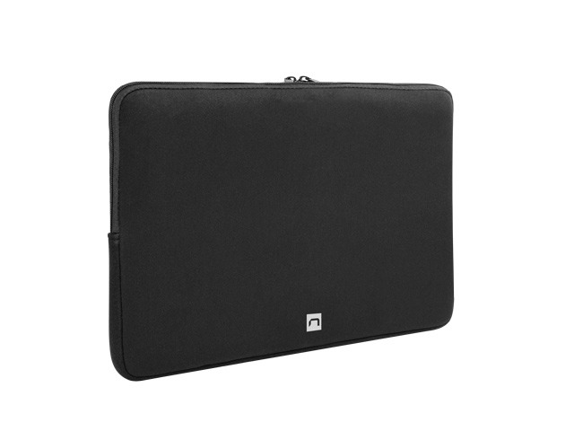
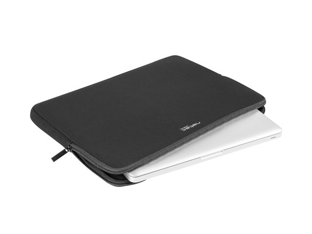
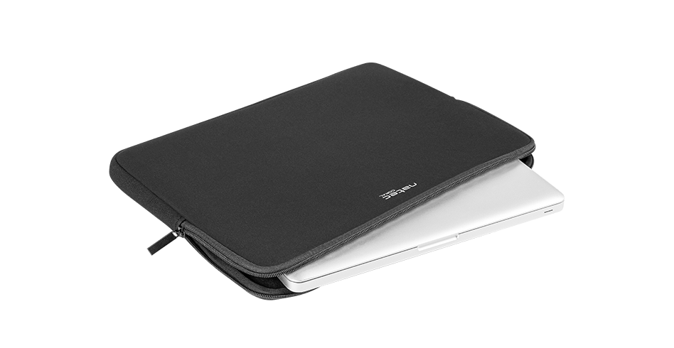
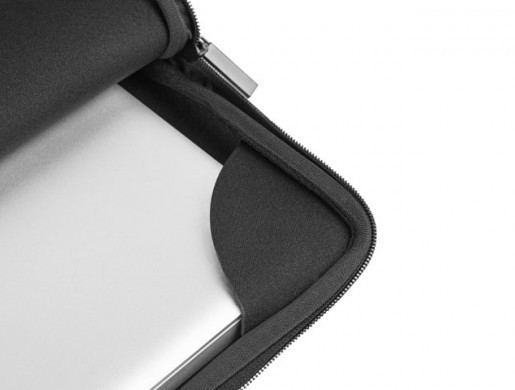
The case made of durable and thick neoprene allows you to effectively protect the equipment against damage and scratches. High-quality material protects your mobile computer and ensures a smooth journey.
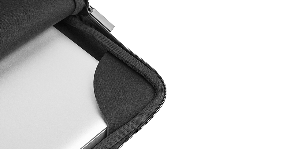
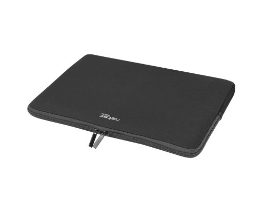
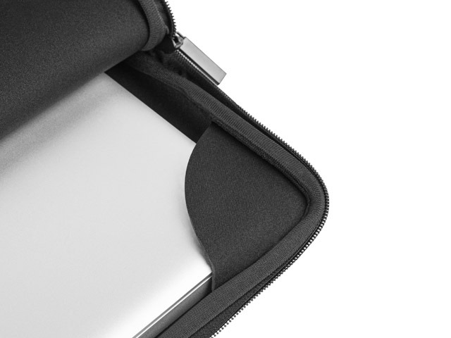
The double zipper will allow you to access your computer much faster and more conveniently. There are additional safeguards inside the case that protect against accidental slipping of the laptop.
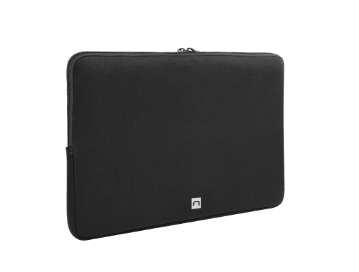
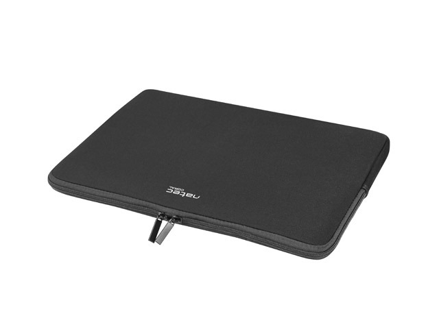
Natec coral is designed for small laptops with a diagonal of 13.3 inches, slightly larger ones with a diagonal of 14.1 inches and standard laptops with a diagonal of 15.6 inches. Thanks to 3 size variants, you can perfectly match the case to your equipment.
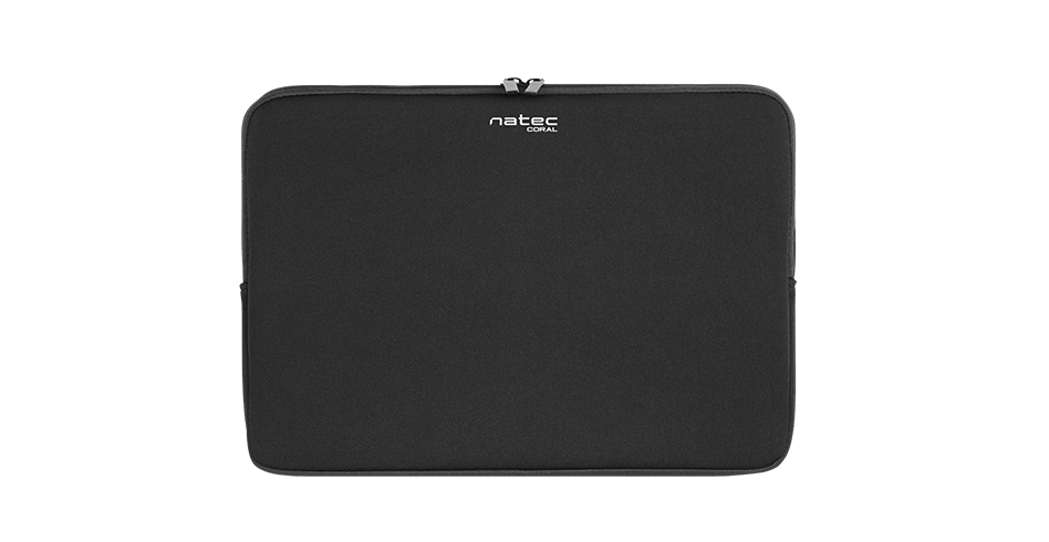
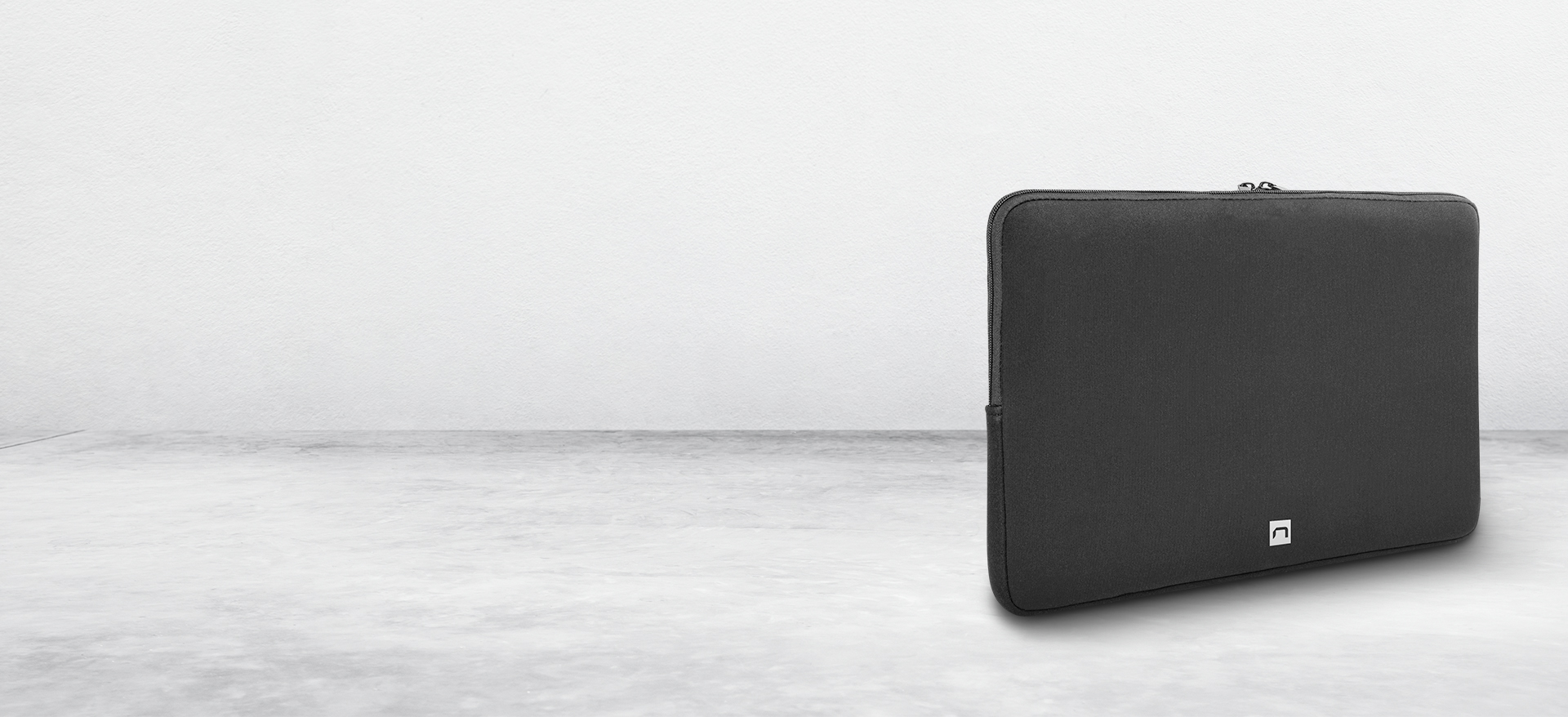
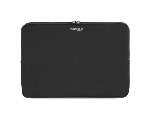
High-quality material, precise finish and black colour create a product with a timeless and elegant appearance. The case is characterized by aesthetics that will perfectly fit in the business environment.
| Type | Sleeve |
| Specialized | Laptops |
| Dedicated size | 14.1 " |
| Compartments | 1 |
| Dedicated pockets/compartments | Laptop |
| Material | Neoprene |
| Lock | Zip |
| Colour | Black |
| Weight | 253 g |
| Length | 370 mm |
| Width | 30 mm |
| Height | 270 mm |
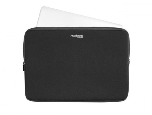


Natec Coral is a durable case made of high-quality materials that will effectively protect your laptop while traveling. The case is available in three sizes, so that each user will find the right size for his device. Natec Coral is suitable for laptops with a screen size of 13.3, 14.1 and 15.6 inches.
