NATEC 
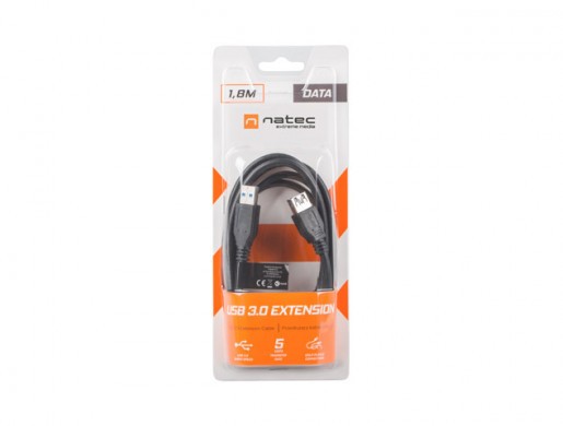
USB-A M/F 3.0 CABLE 1.8M

Description Features Gallery
.pd__container { font-size: 18px; width: 1920px; margin: 0 auto; background: #fff!important; color: #000!important; font-family: 'Exo', sans-serif!important; font-weight: normal; } .relative { position: relative; } .pd__outer { max-width: 1643px; margin: 0 auto; } .pd { margin-bottom: 30px; } .d-flex { display: flex; } .flex-column { flex-direction: column; } .pd__title { font-size: 55px; font-weight: 700; line-height: 1; color: #040505; word-break: break-word; font-family: 'Exo', sans-serif!important; margin: 18px 0 20px; padding: 0 20px; display: inline-block; width: 100%; } .pd__separator { font-size: 18px; text-transform: uppercase; color: #707070; font-weight: 800; font-family: 'Exo', sans-serif!important; background: #fff; display: inline-block; line-height: 24px; padding: 0 60px; position: relative; z-index: 2; } .pd__text-over-image .pd__title{ color: #000; } .pd__text-over-image .pd__text{ color: #fff; max-width: 600px; } .pd__text-over-image { position: absolute; top: 40px; left: 50%; transform: translateX(-50%); } .pd__separator-line { border-top: 2px solid #707070; position: relative; top: 12px; } .pd__separator-container { text-align: center; } .row-reverse { flex-direction: row-reverse; } .align-center { align-items: center; } .pd__text { padding: 0 20px; color: #707070; font-size: 20px; } .pd__text p { margin: 0; } .pd__text--slim { width: 70%; margin: 0 auto; } .pd__image-with-bg { background-color: #ebebeb; } .flex-1 { flex: 1; } .no-visible { opacity: 0; } .mb-0 { margin-bottom: 0; } .mt-30 { margin-top: 30px; } .mt-60 { margin-top: 60px; } .iphone-image-fix { align-items: center; } .pb-30 { padding-bottom: 30px; } .pb-60 { padding-bottom: 60px; } .ph-30 { padding: 30px 0; } .pt-30 { padding-top: 30px; } .pt-60 { padding-top: 60px; } .pd__image-mobile { display: none!important; } .text-center { text-align: center; } .pd-flex { display: flex; } .pd-flex .pd-col-6 { flex: 0 0 50%; } .pd-flex .pd-col-8 { flex: 0 0 calc((100% / 3) * 2); } .pd-flex .pd-col-4 { flex: 0 0 calc(100% / 3); } .justify-center { justify-content: center; } .justify-start { justify-content: flex-start; } .justify-end { justify-content: flex-end; } .pd__img-bg { position: relative; background-repeat: no-repeat!important; background-size: contain; } .pd__absolute-block { position: absolute; top: 0; left: 0; width: 100%; height: 100%; padding: 0 60px 60px; } .pd__absolute-block--padding { padding: 60px 60px; } .pd__absolute-block--center { left: 50%; transform: translateX(-50%); } .pd__absolute-block--right { left: auto; right: 0; } .product-description * { font-family: 'Roboto', sans-serif; } .product-description * { box-sizing: border-box; } .product-description img { max-width: 100%; display: inline-block; margin-bottom: -1px; } .product-description table.border { border-collapse: collapse; border: 0; } .product-description .l-iframe-container { position: relative; padding-top: 56%; } .product-description .l-iframe { position: absolute; top: 0; left: 0; width: 100%; height: 100%; } .product-description table.border td, .product-description table.border th { border: 1px solid #ccc; padding: 8px; } .product-description td.image { padding: 0; } .product-description td img { max-width: 100%; } .product-description table { border: 0; margin: 0; } .product-description table td, .product-description table th { border: 0; padding: 0; } .product-description .center { text-align: center; font: inherit; } .product-description .image { text-align: center; padding-top: 20px; padding-bottom: 20px; } .product-description .bold { font-weight: bold; } .product-description .list2 { text-align: center; list-style-position: inside; list-style-type: circle; padding: 0; } .product-description-table { border-spacing: 0; } .product-description-section, .product-description-section.product-description-table { margin: 0 0 30px 0; overflow: hidden; } .product-description-section.product-description-section-without-margin { padding-top: 0 !important; padding-bottom: 0 !important; } .product-description-text-left { padding-right: 20px!important; font-size: 14px!important; } .product-description-text { text-align: justify; line-height: 1.3; font-size: 16px; color: #000; font-weight: normal; } .product-description-text--full { padding: 0 20px; } .product-description-center { text-align: center; } .product-description-text--with-padding { padding: 0 50px; } .product-description-column { border: none; width: 50%; } .product-description-column-text-left { padding-right: 20px!important; padding-left: 20px!important; } .product-description-column-text-right { padding-left: 20px!important; padding-right: 20px!important; } @media (max-width: 1200px) { .pd-flex .pd-col-8, .pd-flex .pd-col-4, .pd-flex .pd-col-6 { flex: 1 0 100%; } .iphone-image-fix { align-items: center; flex-direction: column; } .pd-flex { flex-wrap: wrap; } .justify-sm-center { justify-content: center; } .pd__title { text-align: center; font-size: 40px; } .pd__absolute-block .pd__title, .pd__absolute-block .pd__text { text-align: left; } .pd__text { text-align: center; font-size: 20px; } .pd__text--sm-slim { width: 70%; margin: 0 auto; } .pb-60 { padding-bottom: 30px; } .pt-60 { padding-top: 30px; } } @media (max-width: 767px) { .pd__title { font-size: 30px; word-break: break-word; padding: 0 5px; } .pd__text { text-align: center; font-size: 18px; } .pd__text--sm-slim, .pd__text--slim { width: 90%; margin: 0 auto; } .pd__img-bg { background-image: none!important; } .pd__absolute-block { max-width: 100%; width: 100%; height: auto; position: inherit; padding: 0 10px; } .pd__absolute-block .pd__title, .pd__absolute-block .pd__text { text-align: center; } .no-visible { opacity: 1; } } @media only screen and (max-width: 1200px) { .text-on-image__title { font-size: 30px; } .text-on-image__text { font-size: 14px; } } @media only screen and (max-width: 1100px) { .text-on-image__title { margin-bottom: 7px; } .text-on-image__text { width: 45%; } } @media only screen and (max-width: 1000px) { .text-on-image__title { font-size: 24px; } } @media only screen and (max-width: 820px) { .text-on-image__image { display: none; } .pd__image-desktop { display: none!important; } .pd__image-mobile { display: block!important; } .text-on-image__title { text-align: center; } .text-on-image { display: flex; flex-wrap: wrap; background-image: none !important; } .product-description-center-narrow { max-width: 100%; text-align: justify!important; padding: 0 20px; } .text-on-image__image--rwd-container { display: block; order: 1; flex: 0 0 100%; } .text-on-image__text { order: 2; flex: 1; position: initial; padding: 40px 20px; } .product-with-features { display: none; } .product-with-features--rwd { display: inline-block; } } @import url('https://fonts.googleapis.com/css?family=Exo:400,500,600,700&display=swap&subset=latin-ext'); @import url('https://fonts.googleapis.com/css?family=Roboto:300,400&display=swap&subset=latin-ext');
USB EXTENSION CABLE M/F 3.0

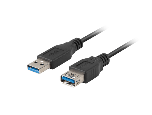
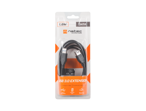
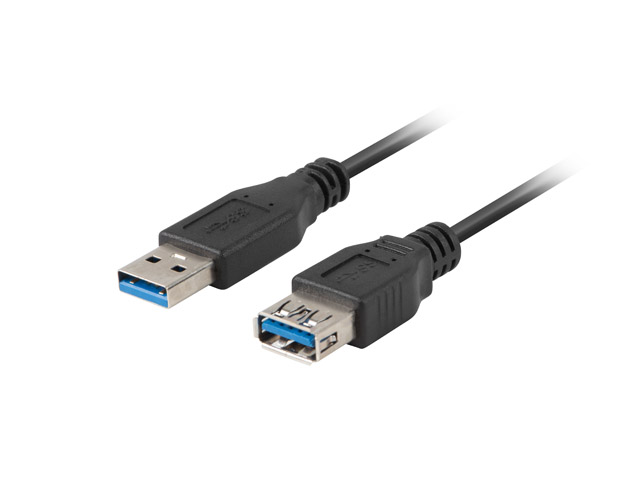
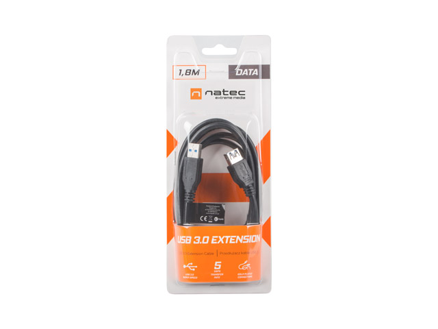
A USB extension cable is an essential piece of equipment for any home or apartment. Extreme Media's USB 3.0 AM-AF cable will make life easier for any user of modern devices.

Don't let yourself be limited!
Features
High-quality materials

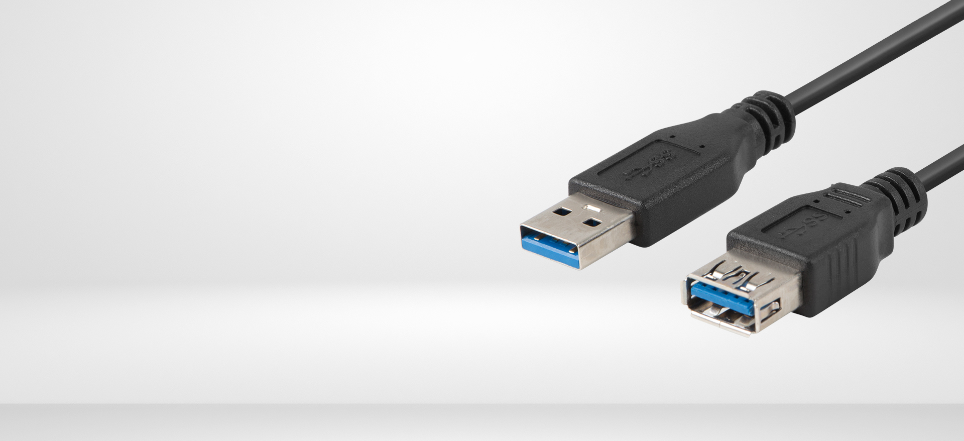
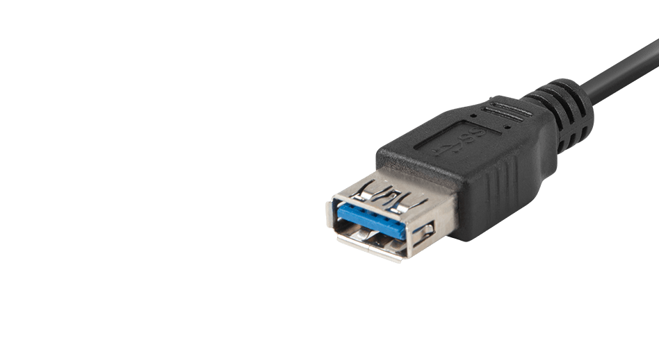
The Natec Extreme Media cable is made of high-quality materials that guarantee safe and trouble-free use. Nickel-plated tips and plastic wire braid will ensure durability for years to come.

Versatile and convenient

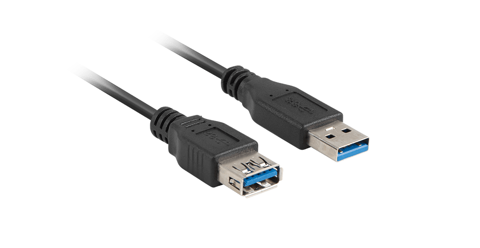
The 180 cm long cable in black will provide convenience when connecting and perfectly fit into any stand.

Features
Connectors USB Type-A
USB Version 3.0
Cable length 180 cm
Transmission speed 5 Gbit/s
Chipset No
Assembly of the connector Nickel
Wire braid Plastic shield
Angle connector No
Colour Black
Gross weight 102 g
Packaging type Blister
Warranty
24 months manufacturer's warranty
We adapt to you
Consent
Details
About
This site uses cookies
We use cookies for the proper operation of the site, to personalize content, to offer social features and to analyze store traffic. Please see our privacy policy for details. Do you agree to the use of cookies?