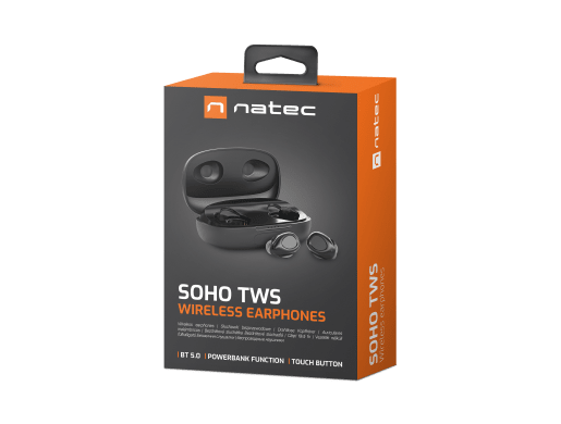
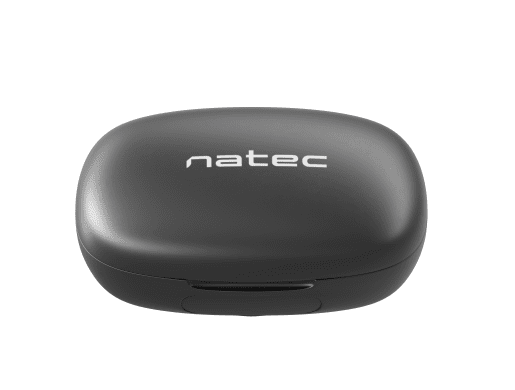
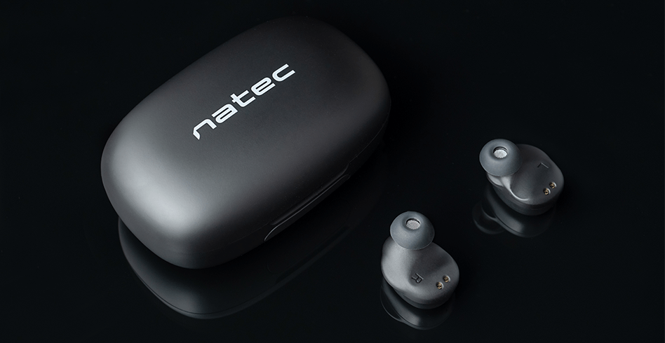
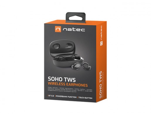
SOHO TWS
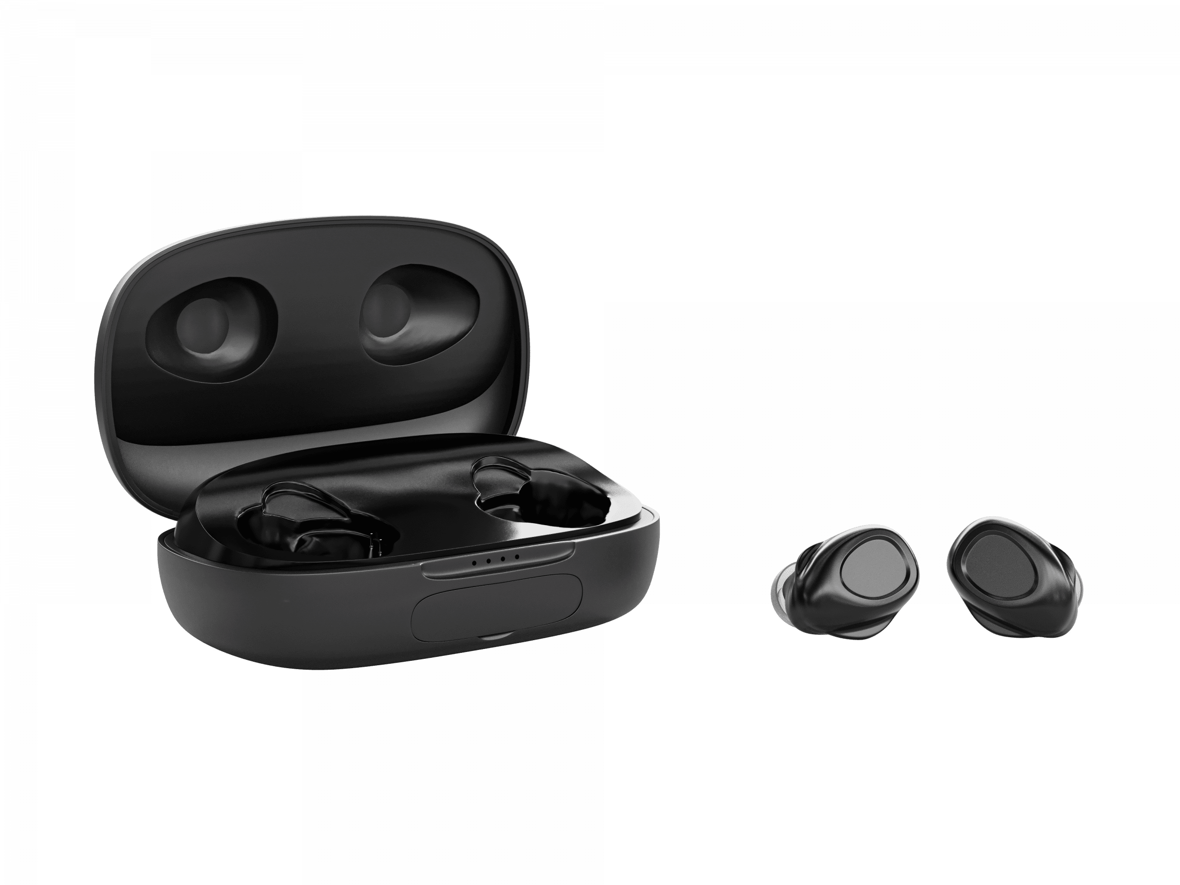
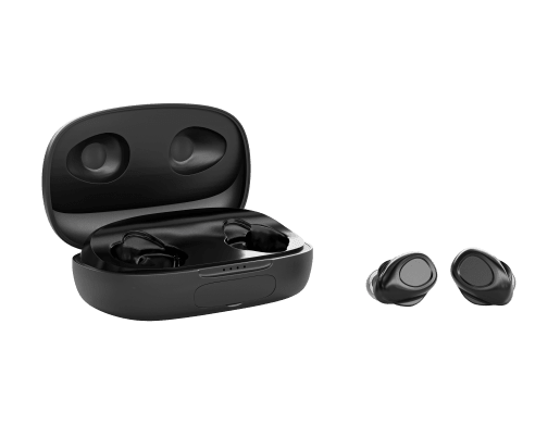
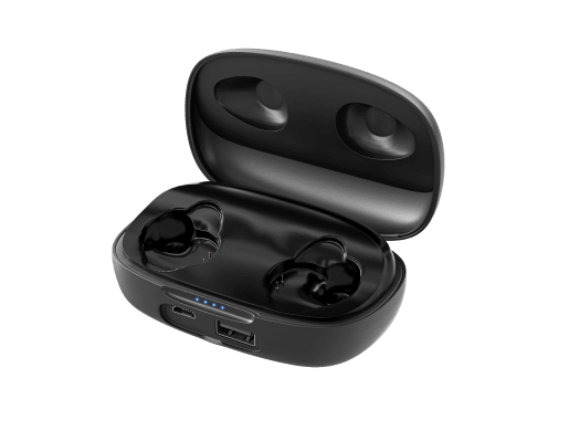
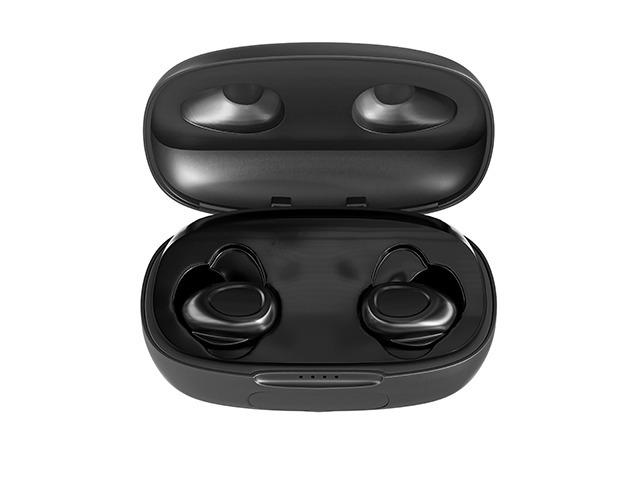


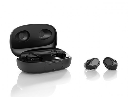
TWS wireless in-ear headphones are an extremely practical solution that allows you to enjoy comfortable calls and high-quality audio playback at any time. Full comfort is delivered by the automatic pairing function right out of the case, as well as intuitive touch control.
Crystal clear sound is provided by high-quality neodymium transducers that perfectly reproduce both low and high frequencies. The bass has been further enhanced, so the headphones will surprise you with extremely deep bass.
The headphones support Bluetooth 5.0, which provides a stable connection and incredibly fast data transfer. Pair your device with natec Soho TWS and enjoy flawless sound!
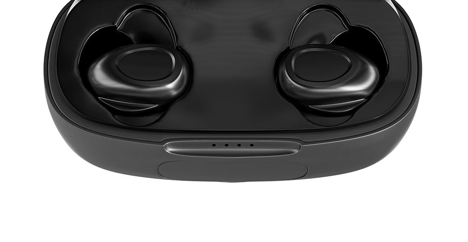
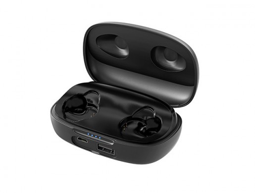
Natec Soho TWS is equipped with a touch pad for fast and intuitive operation. From now on, one touch separates you from receiving/rejecting a call, playing, pausing or scrolling songs, as well as calling a voice assistant.
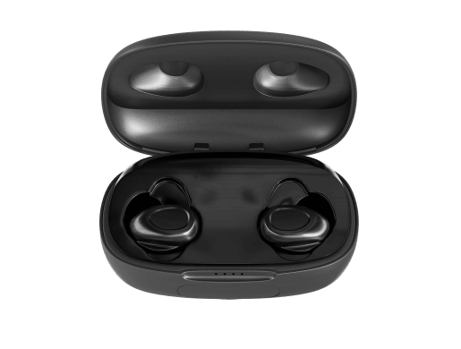
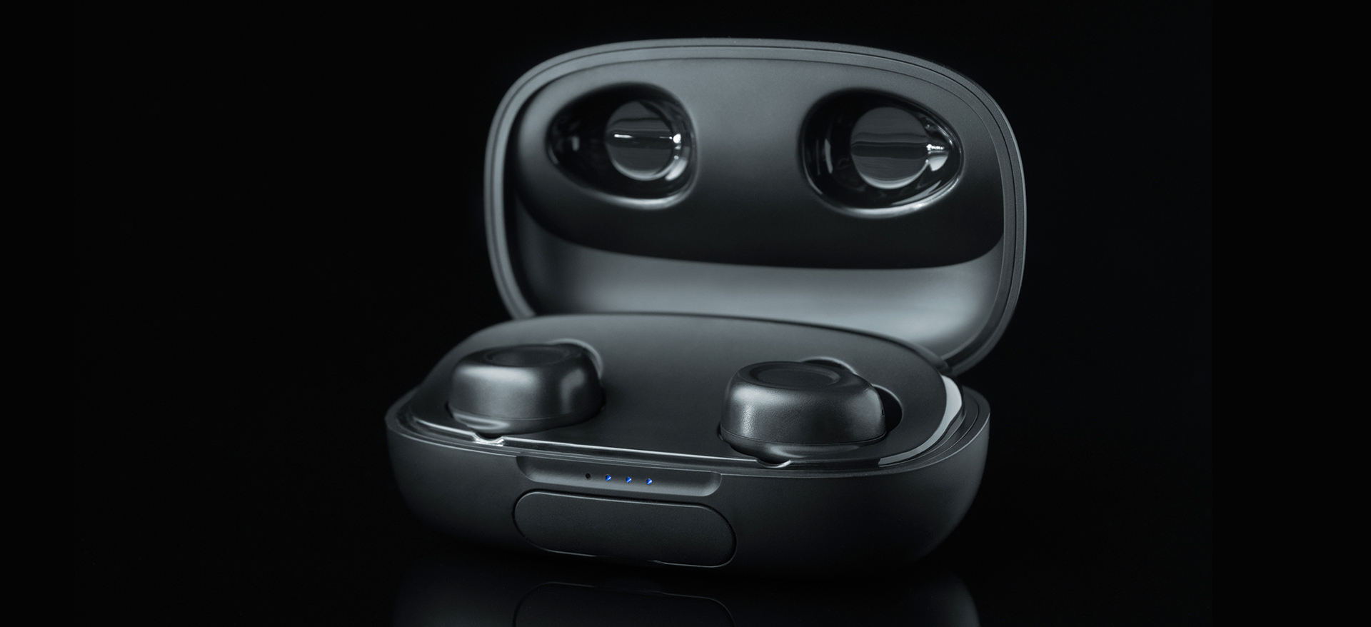
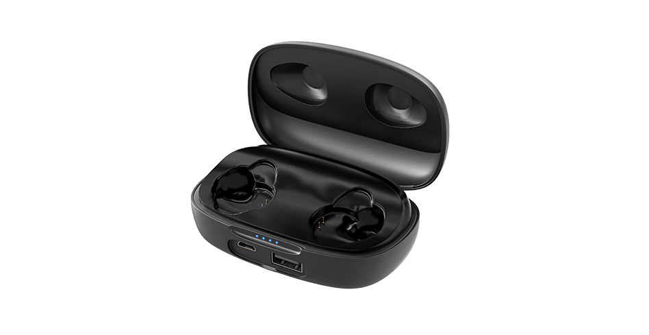
Soho can deliver up to 4 hours of music playback when fully charged. A charging case with 1200 mAh battery allows you to charge the headphones up to 10 times, so the total playing time can be up to 40 hours. Use your headphones without worrying about a discharged battery!
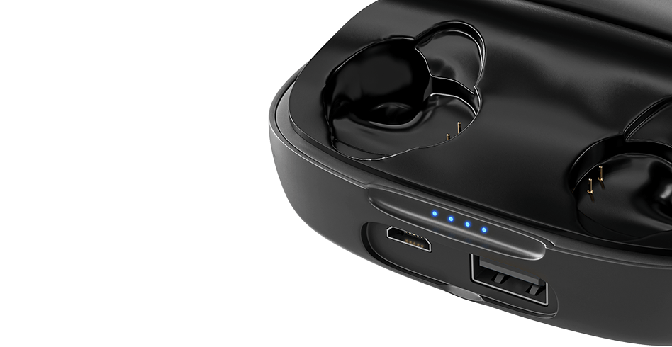
The case can also be used as a power bank to charge other devices. The power bank is fully adapted to modern safety standards, providing overload protection to connected devices.
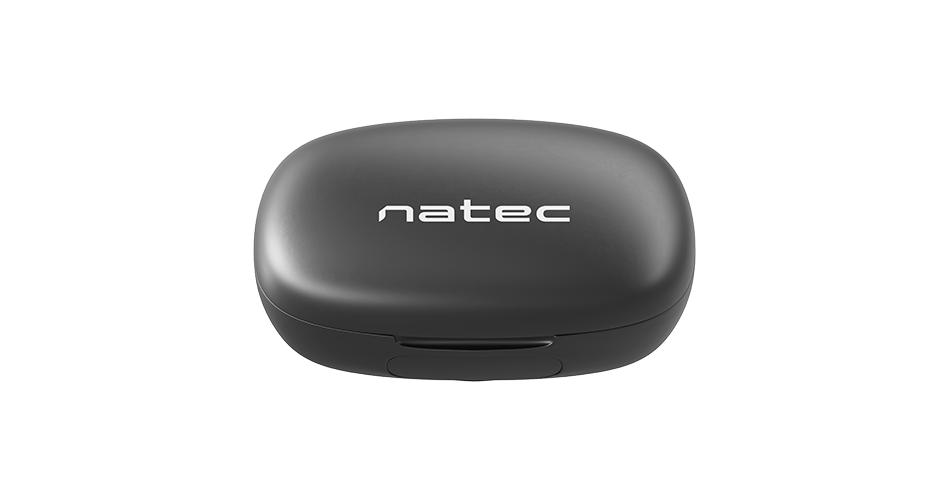
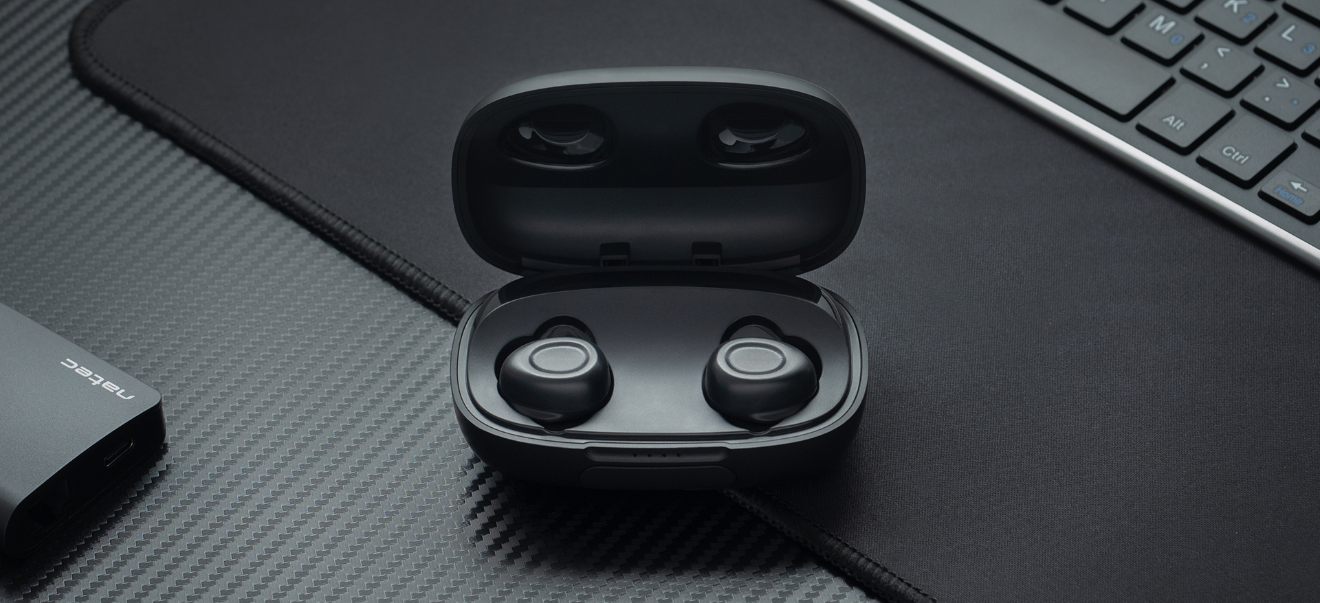
The design of the case is very light and handy, so it is perfect not only to use at home, but also on the go. Put the case with your headphones in your pocket, bag or backpack and take them with you wherever you want!
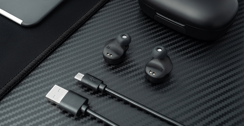
For even greater convenience, the headphones and the case come with a microUSB cable and 3 pairs of S, M and L size rubber bands that can easily fit your ears and provide perfect isolation of ambient sounds.
| Communication | Bluetooth |
| Connectors | Micro USB, USB Type-A |
| Headphones type | In-canal |
| Audio system | 2.0 |
| Microphone | Yes |
| Volume control | No |
| Specialized | Universal |
| Signal to noise ratio | 96 dB |
| Impedance | 16 Ohm |
| Headphones frequency response | 20 - 20000 Hz |
| Maximum input power | 10 mW |
| Sound pressure level | 91 dB |
| Driver unit material | Neodymium magnet |
| Diameter of driver | 6 mm |
| Microphone mount | Built-in |
| Microphone mute | No |
| Microphone sensitivity | -38 dB |
| Microphone frequency response | 10000 - 16000 Hz |
| Functions | Voice assistant |
| Remote control functions | Answer/decline the call, Next/previous track, On/off, Play/Pause, Voice assistant |
| Illumination | No |
| Power supply | Built-in battery |
| Working time | 4 h |
| Cable length | 30 cm |
| Range | 10 m |
| Bluetooth version | 5.0 |
| Wire braid | Rubber coat |
| Material | Plastic |
| Colour | Black |
| Weight | 95 g |
| Included Accessories | Headphones case, MicroUSB cable, Silicone tips (S/M/L) |
| Supported Operating Systems | Android |
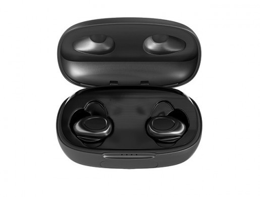

TWS wireless in-ear headphones are an extremely practical solution that allows you to enjoy comfortable calls and high-quality audio playback at any time. Full comfort is delivered by the automatic pairing function right out of the case, as well as intuitive touch control.
