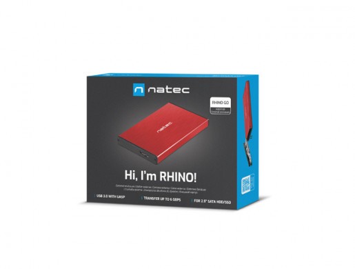
Description Features Gallery
.pd__container { font-size: 18px; width: 1920px; margin: 0 auto; background: #fff!important; color: #000!important; font-family: 'Exo', sans-serif!important; font-weight: normal; } .relative { position: relative; } .pd__outer { max-width: 1643px; margin: 0 auto; } .pd { margin-bottom: 30px; } .d-flex { display: flex; } .flex-column { flex-direction: column; } .pd__title { font-size: 55px; font-weight: 700; line-height: 1; color: #040505; word-break: break-word; font-family: 'Exo', sans-serif!important; margin: 18px 0 20px; padding: 0 20px; display: inline-block; width: 100%; } .pd__separator { font-size: 18px; text-transform: uppercase; color: #707070; font-weight: 800; font-family: 'Exo', sans-serif!important; background: #fff; display: inline-block; line-height: 24px; padding: 0 60px; position: relative; z-index: 2; } .pd__text-over-image .pd__title{ color: #000; } .pd__text-over-image .pd__text{ color: #fff; max-width: 600px; } .pd__text-over-image { position: absolute; top: 40px; left: 50%; transform: translateX(-50%); } .pd__separator-line { border-top: 2px solid #707070; position: relative; top: 12px; } .pd__separator-container { text-align: center; } .row-reverse { flex-direction: row-reverse; } .align-center { align-items: center; } .pd__text { padding: 0 20px; color: #707070; font-size: 20px; } .pd__text p { margin: 0; } .pd__text--slim { width: 70%; margin: 0 auto; } .pd__image-with-bg { background-color: #ebebeb; } .flex-1 { flex: 1; } .no-visible { opacity: 0; } .mb-0 { margin-bottom: 0; } .mt-30 { margin-top: 30px; } .mt-60 { margin-top: 60px; } .iphone-image-fix { align-items: center; } .pb-30 { padding-bottom: 30px; } .pb-60 { padding-bottom: 60px; } .ph-30 { padding: 30px 0; } .pt-30 { padding-top: 30px; } .pt-60 { padding-top: 60px; } .pd__image-mobile { display: none!important; } .text-center { text-align: center; } .pd-flex { display: flex; } .pd-flex .pd-col-6 { flex: 0 0 50%; } .pd-flex .pd-col-8 { flex: 0 0 calc((100% / 3) * 2); } .pd-flex .pd-col-4 { flex: 0 0 calc(100% / 3); } .justify-center { justify-content: center; } .justify-start { justify-content: flex-start; } .justify-end { justify-content: flex-end; } .pd__img-bg { position: relative; background-repeat: no-repeat!important; background-size: contain; } .pd__absolute-block { position: absolute; top: 0; left: 0; width: 100%; height: 100%; padding: 0 60px 60px; } .pd__absolute-block--padding { padding: 60px 60px; } .pd__absolute-block--center { left: 50%; transform: translateX(-50%); } .pd__absolute-block--right { left: auto; right: 0; } .product-description * { font-family: 'Roboto', sans-serif; } .product-description * { box-sizing: border-box; } .product-description img { max-width: 100%; display: inline-block; margin-bottom: -1px; } .product-description table.border { border-collapse: collapse; border: 0; } .product-description .l-iframe-container { position: relative; padding-top: 56%; } .product-description .l-iframe { position: absolute; top: 0; left: 0; width: 100%; height: 100%; } .product-description table.border td, .product-description table.border th { border: 1px solid #ccc; padding: 8px; } .product-description td.image { padding: 0; } .product-description td img { max-width: 100%; } .product-description table { border: 0; margin: 0; } .product-description table td, .product-description table th { border: 0; padding: 0; } .product-description .center { text-align: center; font: inherit; } .product-description .image { text-align: center; padding-top: 20px; padding-bottom: 20px; } .product-description .bold { font-weight: bold; } .product-description .list2 { text-align: center; list-style-position: inside; list-style-type: circle; padding: 0; } .product-description-table { border-spacing: 0; } .product-description-section, .product-description-section.product-description-table { margin: 0 0 30px 0; overflow: hidden; } .product-description-section.product-description-section-without-margin { padding-top: 0 !important; padding-bottom: 0 !important; } .product-description-text-left { padding-right: 20px!important; font-size: 14px!important; } .product-description-text { text-align: justify; line-height: 1.3; font-size: 16px; color: #000; font-weight: normal; } .product-description-text--full { padding: 0 20px; } .product-description-center { text-align: center; } .product-description-text--with-padding { padding: 0 50px; } .product-description-column { border: none; width: 50%; } .product-description-column-text-left { padding-right: 20px!important; padding-left: 20px!important; } .product-description-column-text-right { padding-left: 20px!important; padding-right: 20px!important; } @media (max-width: 1200px) { .pd-flex .pd-col-8, .pd-flex .pd-col-4, .pd-flex .pd-col-6 { flex: 1 0 100%; } .iphone-image-fix { align-items: center; flex-direction: column; } .pd-flex { flex-wrap: wrap; } .justify-sm-center { justify-content: center; } .pd__title { text-align: center; font-size: 40px; } .pd__absolute-block .pd__title, .pd__absolute-block .pd__text { text-align: left; } .pd__text { text-align: center; font-size: 20px; } .pd__text--sm-slim { width: 70%; margin: 0 auto; } .pb-60 { padding-bottom: 30px; } .pt-60 { padding-top: 30px; } } @media (max-width: 767px) { .pd__title { font-size: 30px; word-break: break-word; padding: 0 5px; } .pd__text { text-align: center; font-size: 18px; } .pd__text--sm-slim, .pd__text--slim { width: 90%; margin: 0 auto; } .pd__img-bg { background-image: none!important; } .pd__absolute-block { max-width: 100%; width: 100%; height: auto; position: inherit; padding: 0 10px; } .pd__absolute-block .pd__title, .pd__absolute-block .pd__text { text-align: center; } .no-visible { opacity: 1; } } @media only screen and (max-width: 1200px) { .text-on-image__title { font-size: 30px; } .text-on-image__text { font-size: 14px; } } @media only screen and (max-width: 1100px) { .text-on-image__title { margin-bottom: 7px; } .text-on-image__text { width: 45%; } } @media only screen and (max-width: 1000px) { .text-on-image__title { font-size: 24px; } } @media only screen and (max-width: 820px) { .text-on-image__image { display: none; } .pd__image-desktop { display: none!important; } .pd__image-mobile { display: block!important; } .text-on-image__title { text-align: center; } .text-on-image { display: flex; flex-wrap: wrap; background-image: none !important; } .product-description-center-narrow { max-width: 100%; text-align: justify!important; padding: 0 20px; } .text-on-image__image--rwd-container { display: block; order: 1; flex: 0 0 100%; } .text-on-image__text { order: 2; flex: 1; position: initial; padding: 40px 20px; } .product-with-features { display: none; } .product-with-features--rwd { display: inline-block; } } @import url('https://fonts.googleapis.com/css?family=Exo:400,500,600,700&display=swap&subset=latin-ext'); @import url('https://fonts.googleapis.com/css?family=Roboto:300,400&display=swap&subset=latin-ext');
Hdd / ssd enclosure

Nowadays, information becomes an important and valuable commodity. Therefore, the need to protect valuable data is becoming increasingly important, not only in the world of public institutions and spies, but also in business as well as in the comfort of your own home. The external enclosure from the Natec Rhino series will ensure the convenience of use and security.

Secure your drive and be confident about the data on it!
special features
Functional and compatible

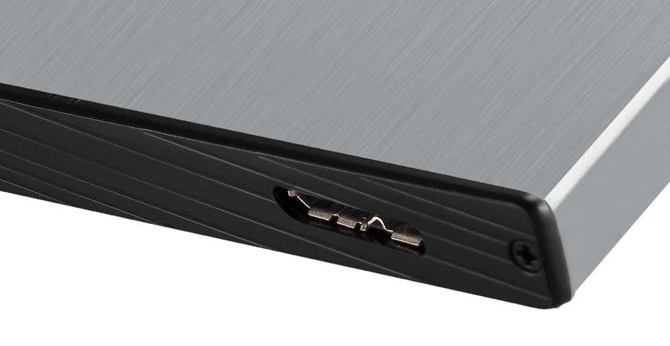
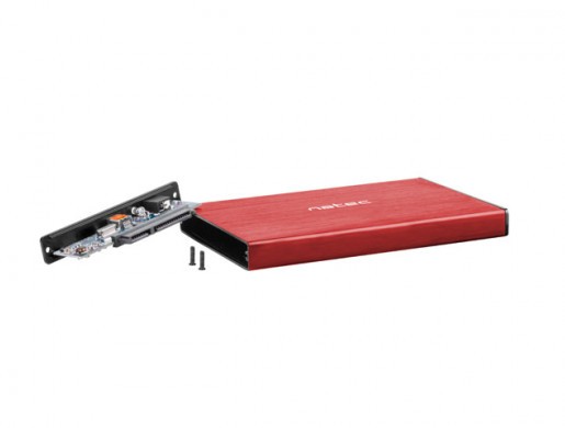
Thanks to the USB 3.0 technology with the UASP protocol, Rhino GO enables data transfer at speeds up to 6 Gb / s. The housing supports SATA I / II / III 9.5 mm interface and both HDDs and SSDs with a capacity of up to 4TB.

Elegant and durable

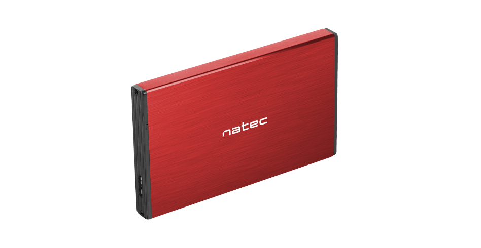
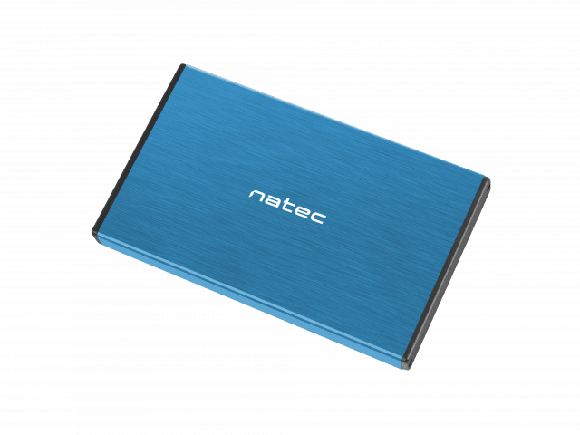
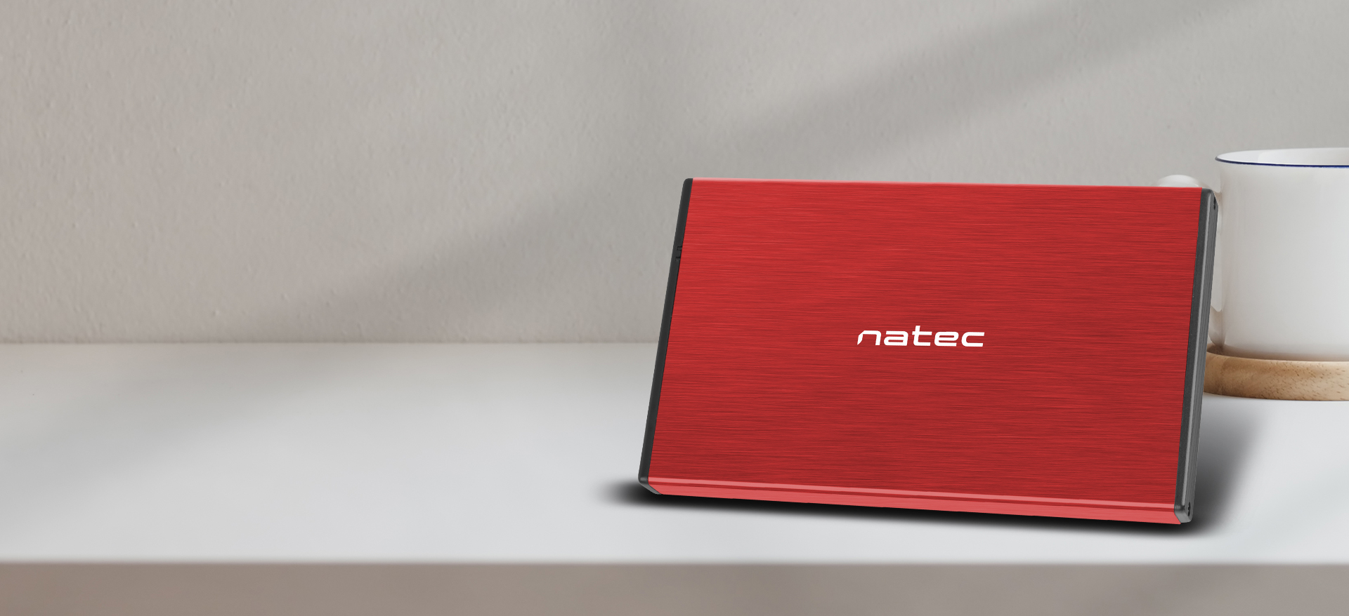
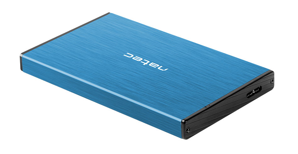
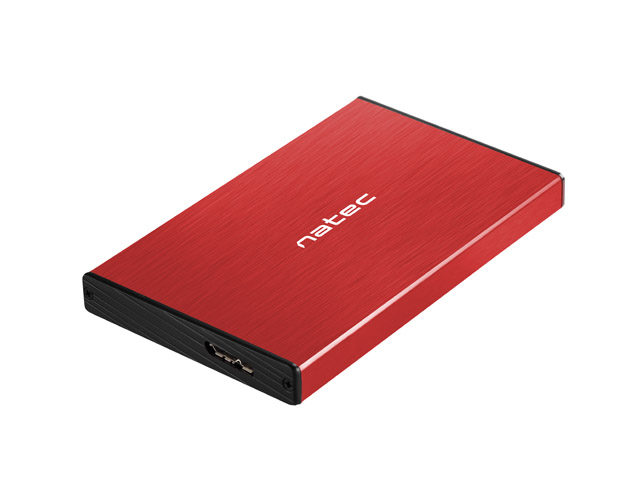
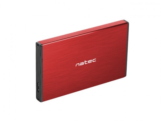
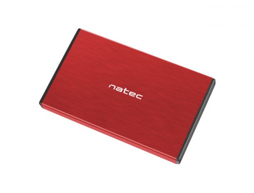
The housing is made of high-quality brushed aluminium, thanks to which it perfectly protects the disk inside against any type of mechanical damage. In addition, aluminium supports optimal heat dissipation during disk operation. The housing is available in 4 colour variants.

additional features
Simple handling

The Plug & Play function guarantees instant operation without the need for any further interference. The product does not require the installation of any additional drivers.

Convenience of use

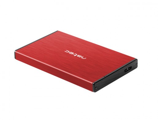
The product allows you to speed up the process of accessing data and does not take up much space. It is powered by the USB port and does not require the use of additional, bulky power adapters or chargers. Built-in LED indicates connection to power and readiness.

Features
Disk size 2.5"
Drive interface 22-pin SATA III (6 Gbps)
Connectors Micro USB 3.0
USB Version 3.0
Number of mounted drives 1
UASP support Yes
Material Aluminium
Work signal LED
Colour Red
Weight 33 g
Included Accessories Micro USB Cable, Set of assembly elements
System requirements
Supported Operating Systems Linux, MAC, Windows
Warranty
24 months manufacturer's warranty
Dimensions
Length 130 mm
Width 78 mm
Height 12.3 mm
Download
We adapt to you
Consent
Details
About
This site uses cookies
We use cookies for the proper operation of the site, to personalize content, to offer social features and to analyze store traffic. Please see our privacy policy for details. Do you agree to the use of cookies?