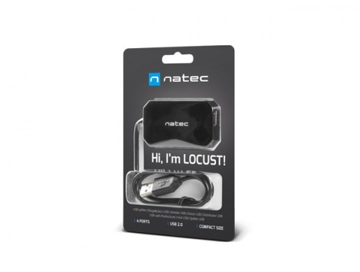
NATEC LOCUST

Description Gallery
.pd__container { font-size: 18px; width: 1920px; margin: 0 auto; background: #fff!important; color: #000!important; font-family: 'Exo', sans-serif!important; font-weight: normal; } .relative { position: relative; } .pd__outer { max-width: 1643px; margin: 0 auto; } .pd { margin-bottom: 30px; } .d-flex { display: flex; } .flex-column { flex-direction: column; } .pd__title { font-size: 55px; font-weight: 700; line-height: 1; color: #040505; word-break: break-word; font-family: 'Exo', sans-serif!important; margin: 18px 0 20px; padding: 0 20px; display: inline-block; width: 100%; } .pd__separator { font-size: 18px; text-transform: uppercase; color: #707070; font-weight: 800; font-family: 'Exo', sans-serif!important; background: #fff; display: inline-block; line-height: 24px; padding: 0 60px; position: relative; z-index: 2; } .pd__text-over-image .pd__title{ color: #000; } .pd__text-over-image .pd__text{ color: #fff; max-width: 600px; } .pd__text-over-image { position: absolute; top: 40px; left: 50%; transform: translateX(-50%); } .pd__separator-line { border-top: 2px solid #707070; position: relative; top: 12px; } .pd__separator-container { text-align: center; } .row-reverse { flex-direction: row-reverse; } .align-center { align-items: center; } .pd__text { padding: 0 20px; color: #707070; font-size: 20px; } .pd__text p { margin: 0; } .pd__text--slim { width: 70%; margin: 0 auto; } .pd__image-with-bg { background-color: #ebebeb; } .flex-1 { flex: 1; } .no-visible { opacity: 0; } .mb-0 { margin-bottom: 0; } .mt-30 { margin-top: 30px; } .mt-60 { margin-top: 60px; } .iphone-image-fix { align-items: center; } .pb-30 { padding-bottom: 30px; } .pb-60 { padding-bottom: 60px; } .ph-30 { padding: 30px 0; } .pt-30 { padding-top: 30px; } .pt-60 { padding-top: 60px; } .pd__image-mobile { display: none!important; } .text-center { text-align: center; } .pd-flex { display: flex; } .pd-flex .pd-col-6 { flex: 0 0 50%; } .pd-flex .pd-col-8 { flex: 0 0 calc((100% / 3) * 2); } .pd-flex .pd-col-4 { flex: 0 0 calc(100% / 3); } .justify-center { justify-content: center; } .justify-start { justify-content: flex-start; } .justify-end { justify-content: flex-end; } .pd__img-bg { position: relative; background-repeat: no-repeat!important; background-size: contain; } .pd__absolute-block { position: absolute; top: 0; left: 0; width: 100%; height: 100%; padding: 0 60px 60px; } .pd__absolute-block--padding { padding: 60px 60px; } .pd__absolute-block--center { left: 50%; transform: translateX(-50%); } .pd__absolute-block--right { left: auto; right: 0; } .product-description * { font-family: 'Roboto', sans-serif; } .product-description * { box-sizing: border-box; } .product-description img { max-width: 100%; display: inline-block; margin-bottom: -1px; } .product-description table.border { border-collapse: collapse; border: 0; } .product-description .l-iframe-container { position: relative; padding-top: 56%; } .product-description .l-iframe { position: absolute; top: 0; left: 0; width: 100%; height: 100%; } .product-description table.border td, .product-description table.border th { border: 1px solid #ccc; padding: 8px; } .product-description td.image { padding: 0; } .product-description td img { max-width: 100%; } .product-description table { border: 0; margin: 0; } .product-description table td, .product-description table th { border: 0; padding: 0; } .product-description .center { text-align: center; font: inherit; } .product-description .image { text-align: center; padding-top: 20px; padding-bottom: 20px; } .product-description .bold { font-weight: bold; } .product-description .list2 { text-align: center; list-style-position: inside; list-style-type: circle; padding: 0; } .product-description-table { border-spacing: 0; } .product-description-section, .product-description-section.product-description-table { margin: 0 0 30px 0; overflow: hidden; } .product-description-section.product-description-section-without-margin { padding-top: 0 !important; padding-bottom: 0 !important; } .product-description-text-left { padding-right: 20px!important; font-size: 14px!important; } .product-description-text { text-align: justify; line-height: 1.3; font-size: 16px; color: #000; font-weight: normal; } .product-description-text--full { padding: 0 20px; } .product-description-center { text-align: center; } .product-description-text--with-padding { padding: 0 50px; } .product-description-column { border: none; width: 50%; } .product-description-column-text-left { padding-right: 20px!important; padding-left: 20px!important; } .product-description-column-text-right { padding-left: 20px!important; padding-right: 20px!important; } @media (max-width: 1200px) { .pd-flex .pd-col-8, .pd-flex .pd-col-4, .pd-flex .pd-col-6 { flex: 1 0 100%; } .iphone-image-fix { align-items: center; flex-direction: column; } .pd-flex { flex-wrap: wrap; } .justify-sm-center { justify-content: center; } .pd__title { text-align: center; font-size: 40px; } .pd__absolute-block .pd__title, .pd__absolute-block .pd__text { text-align: left; } .pd__text { text-align: center; font-size: 20px; } .pd__text--sm-slim { width: 70%; margin: 0 auto; } .pb-60 { padding-bottom: 30px; } .pt-60 { padding-top: 30px; } } @media (max-width: 767px) { .pd__title { font-size: 30px; word-break: break-word; padding: 0 5px; } .pd__text { text-align: center; font-size: 18px; } .pd__text--sm-slim, .pd__text--slim { width: 90%; margin: 0 auto; } .pd__img-bg { background-image: none!important; } .pd__absolute-block { max-width: 100%; width: 100%; height: auto; position: inherit; padding: 0 10px; } .pd__absolute-block .pd__title, .pd__absolute-block .pd__text { text-align: center; } .no-visible { opacity: 1; } } @media only screen and (max-width: 1200px) { .text-on-image__title { font-size: 30px; } .text-on-image__text { font-size: 14px; } } @media only screen and (max-width: 1100px) { .text-on-image__title { margin-bottom: 7px; } .text-on-image__text { width: 45%; } } @media only screen and (max-width: 1000px) { .text-on-image__title { font-size: 24px; } } @media only screen and (max-width: 820px) { .text-on-image__image { display: none; } .pd__image-desktop { display: none!important; } .pd__image-mobile { display: block!important; } .text-on-image__title { text-align: center; } .text-on-image { display: flex; flex-wrap: wrap; background-image: none !important; } .product-description-center-narrow { max-width: 100%; text-align: justify!important; padding: 0 20px; } .text-on-image__image--rwd-container { display: block; order: 1; flex: 0 0 100%; } .text-on-image__text { order: 2; flex: 1; position: initial; padding: 40px 20px; } .product-with-features { display: none; } .product-with-features--rwd { display: inline-block; } } @import url('https://fonts.googleapis.com/css?family=Exo:400,500,600,700&display=swap&subset=latin-ext'); @import url('https://fonts.googleapis.com/css?family=Roboto:300,400&display=swap&subset=latin-ext');
USB 2.0 HUB

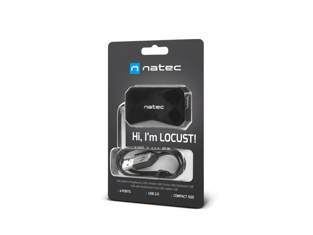
Natec Locust is a functional adapter that allows you to increase the number of useful ports in laptops and PCs. Nowadays, USB HUBs become an extremely important addition to modern notebook computers, in which the number of available slots is increasingly limited.

Comfort and functionality in a compact size
features
Even more accessories

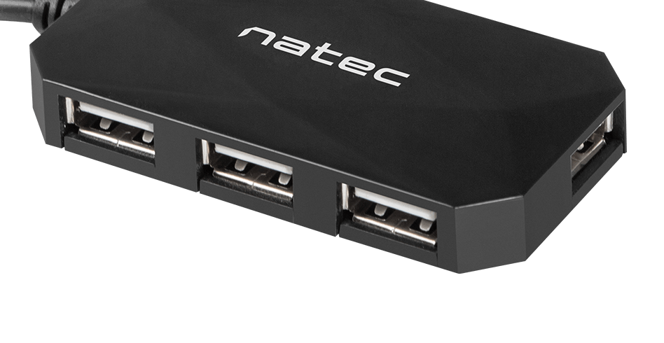
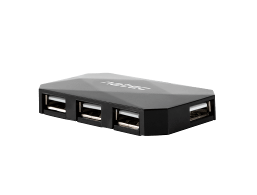
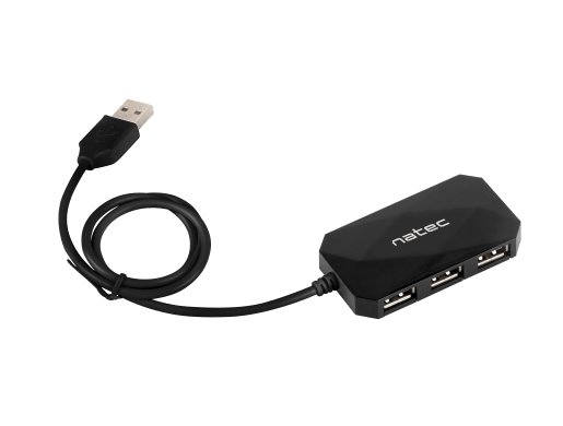
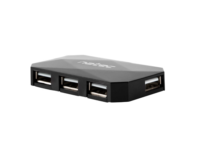
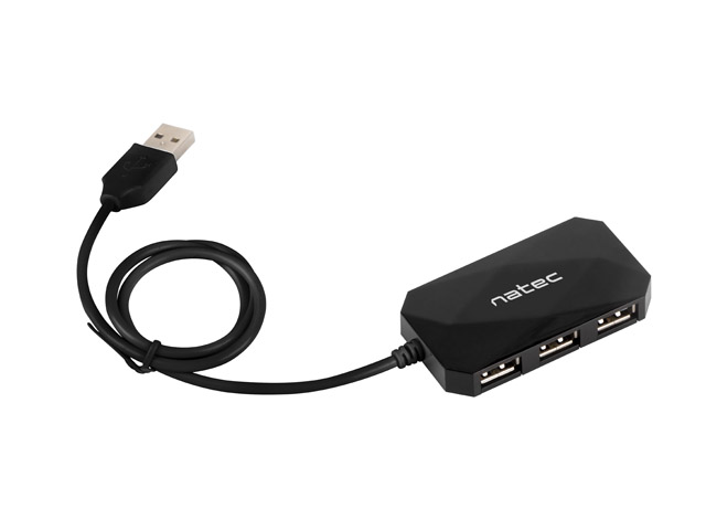
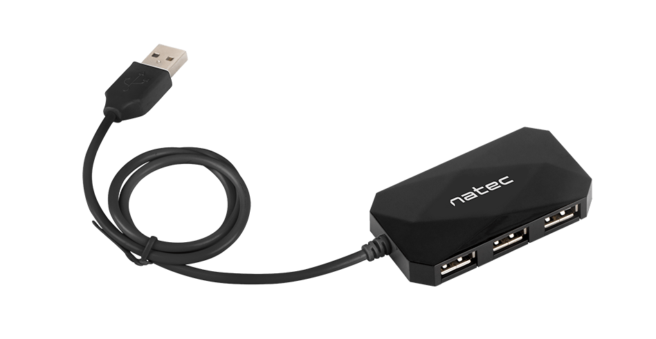
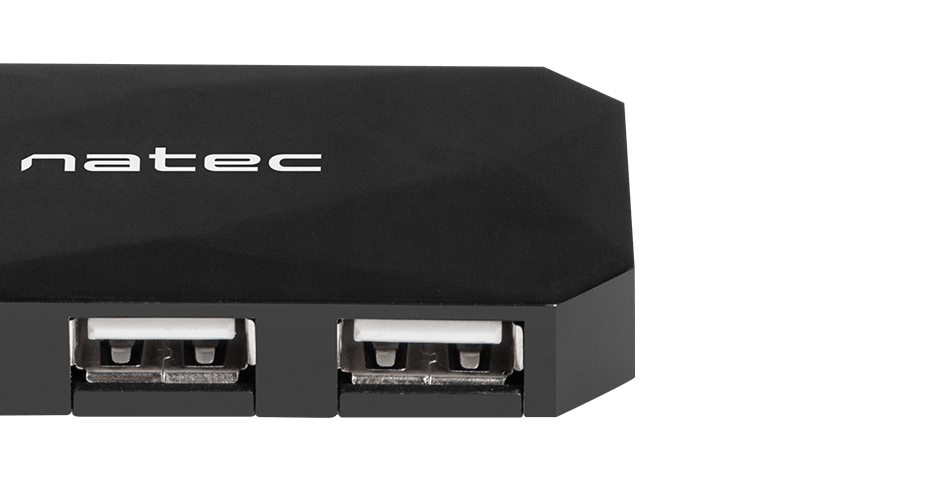
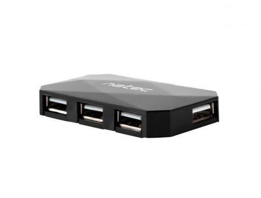
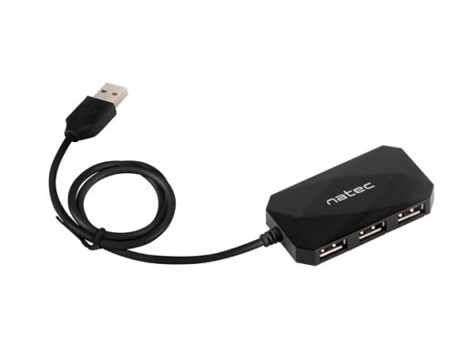
The hub is equipped with 4 usb 2.0 ports , which will allow you to easily connect more accessories to your computer. Built-in slots ensure data transfer with a maximum speed of 480 mb / s.

Plug & Play

The plug & play function guarantees instant operation without the need to install and drivers or software. 

Minimalist design

Due to its compact size and flat profile, locust takes up little space and can be connected to a computer or laptop without any problems at all times. The cable with an optimal length of 60 cm makes the device extremely handy.

We adapt to you
Consent
Details
About
This site uses cookies
We use cookies for the proper operation of the site, to personalize content, to offer social features and to analyze store traffic. Please see our privacy policy for details. Do you agree to the use of cookies?