NANGER
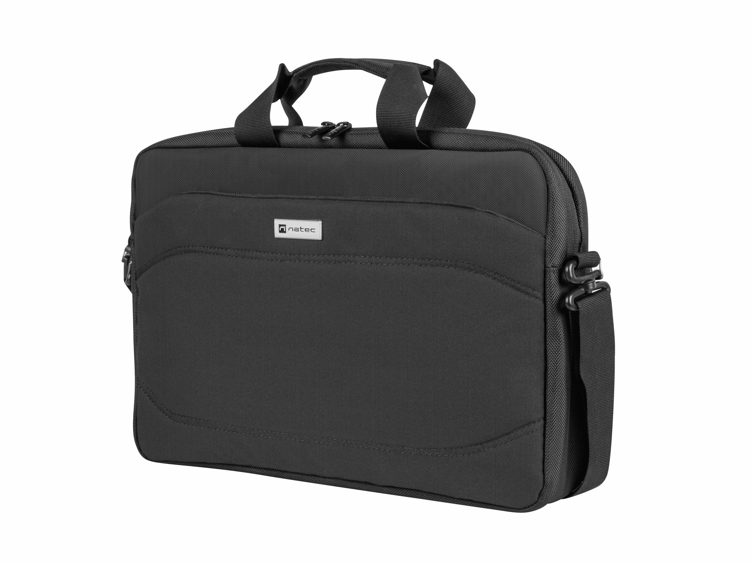
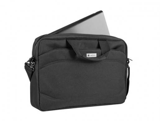
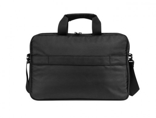
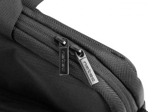
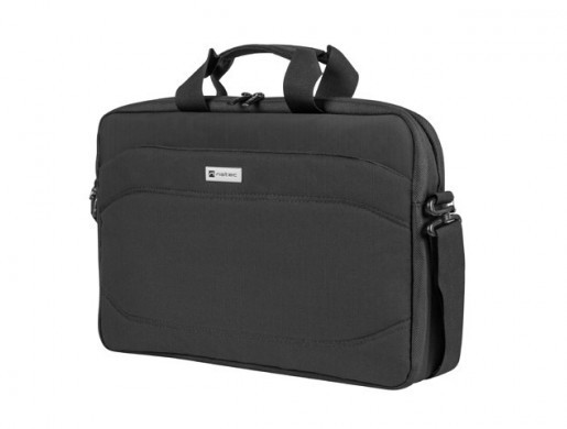
Safety and functionality. Choose the Natec Nanger 15,6". A durable bag that will protect your laptop and accessories. Zippered, soft main compartment, additional pockets, reinforced handle and adjustable strap with cushioning foam. This is the Natec Nanger 15,6".
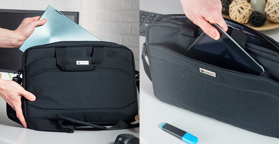
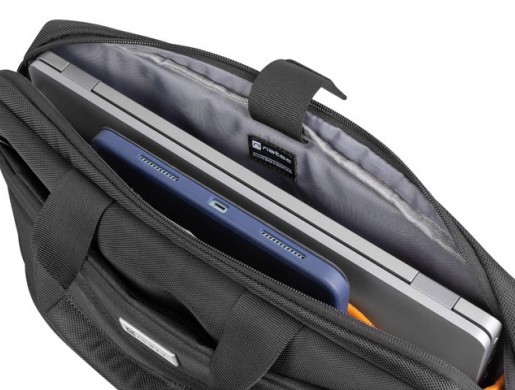
Do you travel often and want to not only carry your devices comfortably, but also keep them safe? Meet the Natec Nanger, a bag that can fit a laptop up to 15,6", and that's not all. In addition to the laptop space, you'll also find a pocket for your tablet. Both compartments are distinguished by soft and pleasant to the touch material, which will significantly reduce the risk of mechanical damage to your equipment.
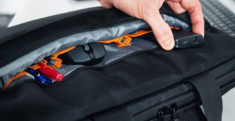
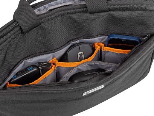
Don't give up your favorite accessories. With the Natec Nanger you can take them with you . All thanks to the front external pocket with up to 3 slots for office supplies and accessories. Mouse? A portable drive? Smartphone? In addition to them, you can easily fit your favorite set of pens and even your wallet.
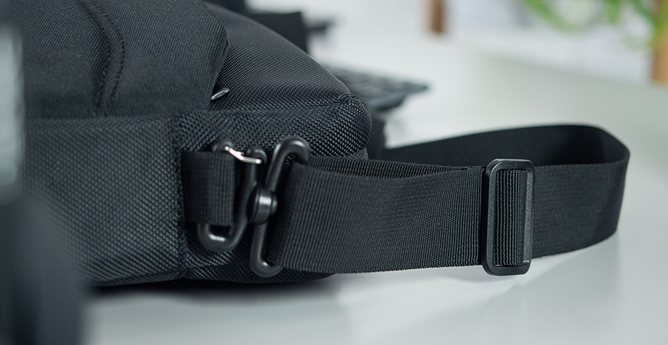
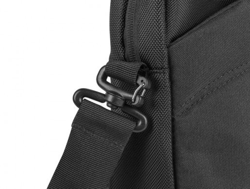
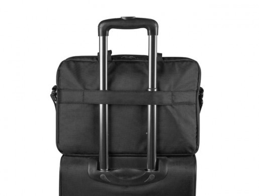
Small bag, big possibilities. Want to customize it to fit your own style? You'll do it easily with an adjustable shoulder strap with soft, cushioning foam. You can also easily attach it to the telescopic handle of your suitcase, all with the "Trolley" system.
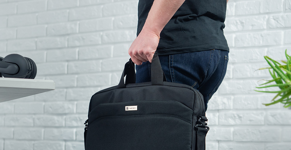
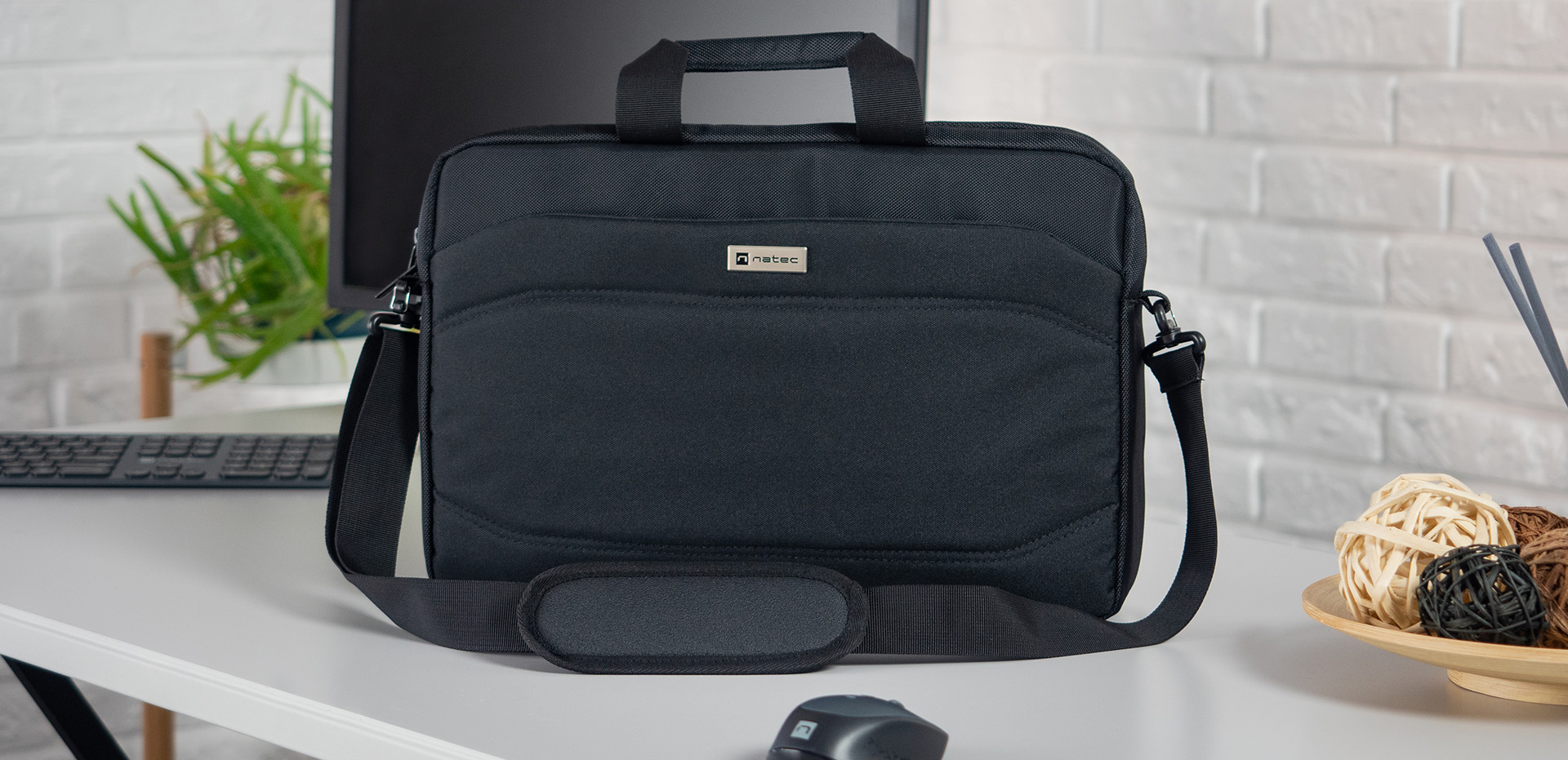
Do you prefer to carry the bag using the handle? From now on you don't have to worry about its durability. It has been reinforced so that Natec Nanger will enjoy its functionality for a long time. Comfort? You will gain it thanks to the soft finish providing not only comfort, but also a secure grip.
| Type | Bag |
| Specialized | Laptops |
| Dedicated size | 15.6 " |
| Compartments | 1 |
| Dedicated pockets/compartments | Accesories, Documents, Laptop, Mobile phone, Tablet |
| Total number of pockets | 6 |
| Number of outer pockets | 1 |
| Material | Polyester 1680D, Polyester 900D |
| Lock | Zip |
| Colour | Black |
| Construction | Shoulder belt, System Trolley |
| Shoulder strap | Yes |
| Handle | Yes |
| Laptop compartment length | 380 mm |
| Laptop compartment width | 35 mm |
| Laptop compartment height | 250 mm |
| Weight | 540 g |
| Length | 410 mm |
| Width | 70 mm |
| Height | 290 mm |
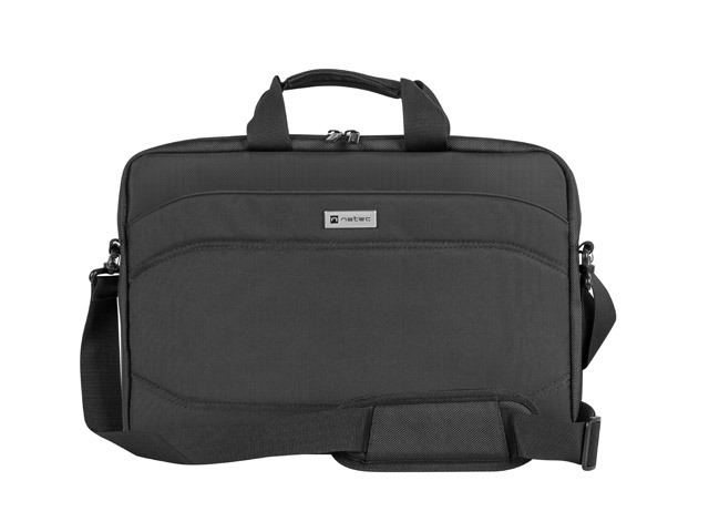

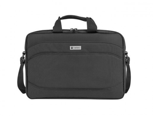
Safety and functionality. Choose the Natec Nanger 15,6". A durable bag that will protect your laptop and accessories. Zippered, soft main compartment, additional pockets, reinforced handle and adjustable strap with cushioning foam. This is the Natec Nanger 15,6".
