FOWLER MINI
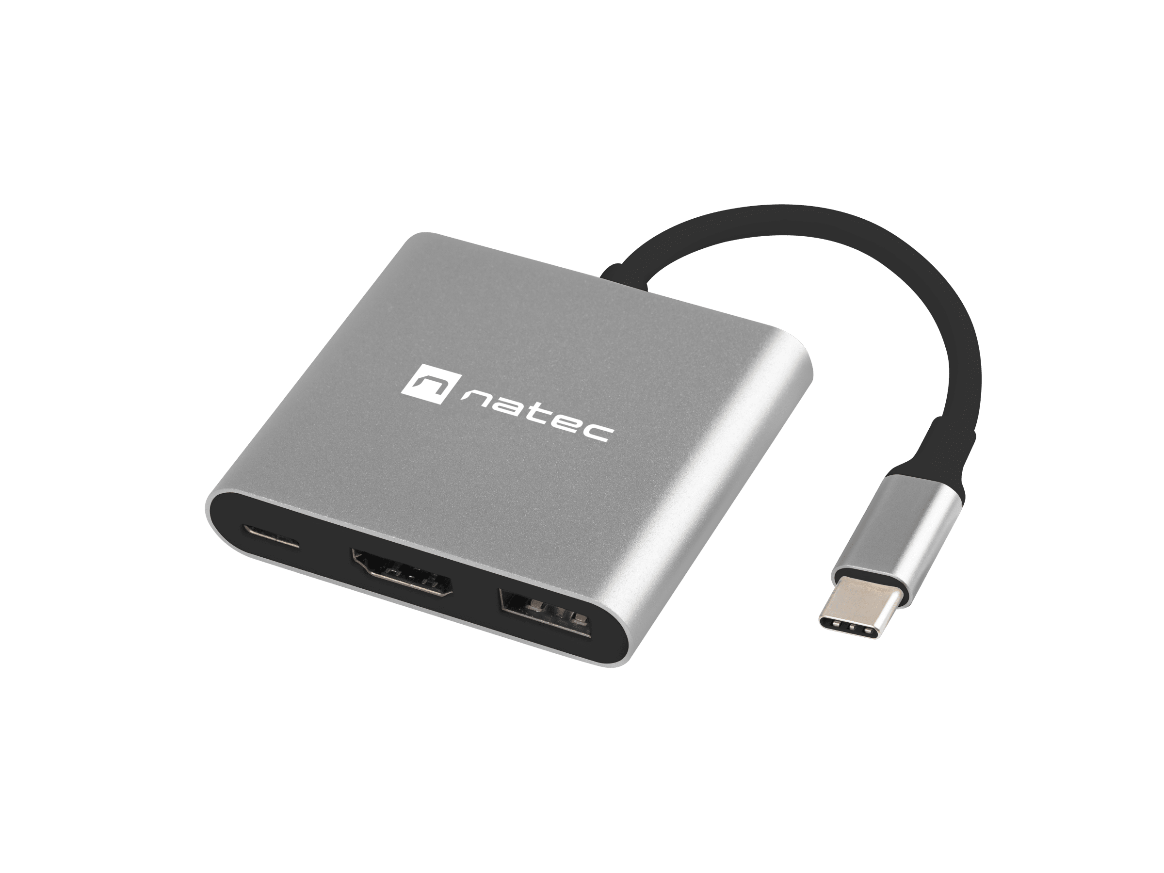
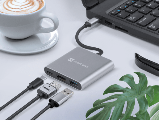
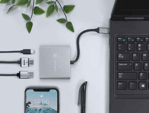

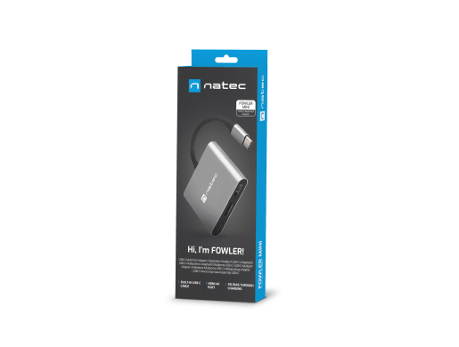
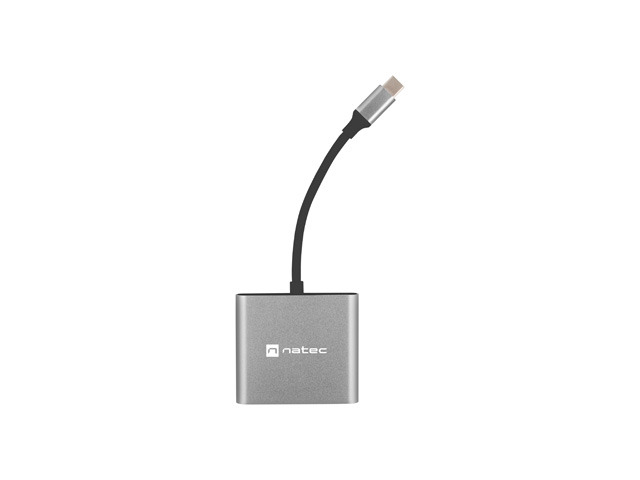


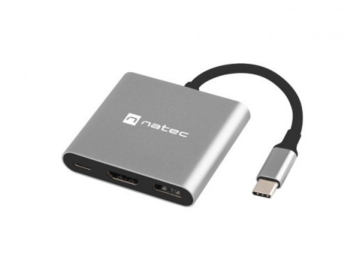
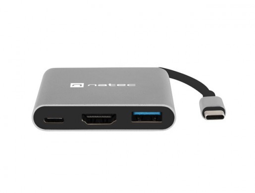
Multiport Hub - Natec Fowler Mini is a product that will allow you to increase the number of ports in your computer. Expand your hardware capabilities with a three port adapter.
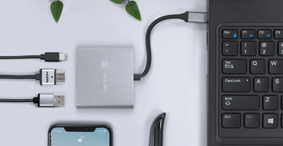
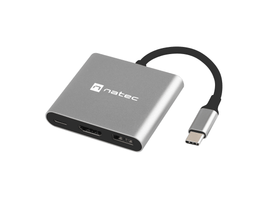
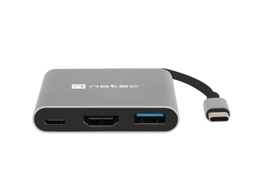
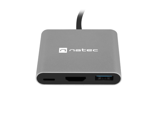
A large number of output ports gives you unlimited possibilities to work with many accessories. The adapter is equipped with: HDMI 4K x 30Hz or Full HD 1080p x 60Hz, USB 3.0 and USB-C port.
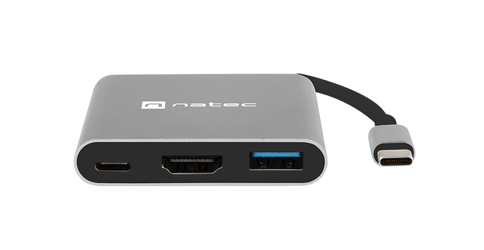
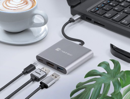
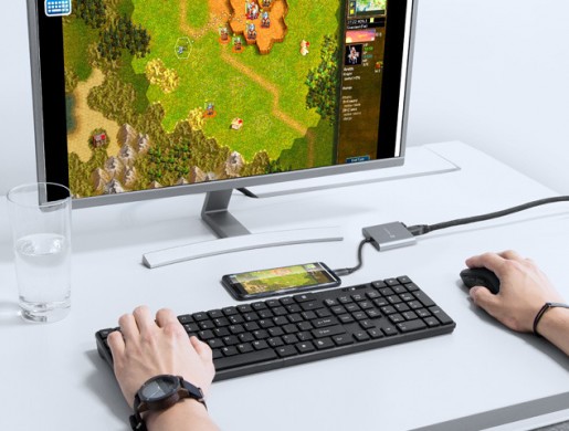
The adapter's modern HDMI port supports high-resolution video transfer up to 4K. Multiport capability guarantees the best multimedia quality on the big screen, no matter what device you connect to it.
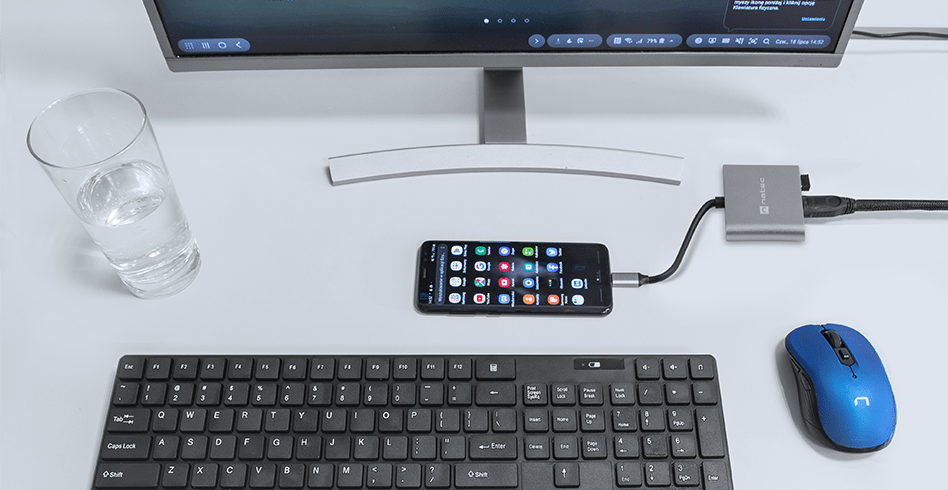
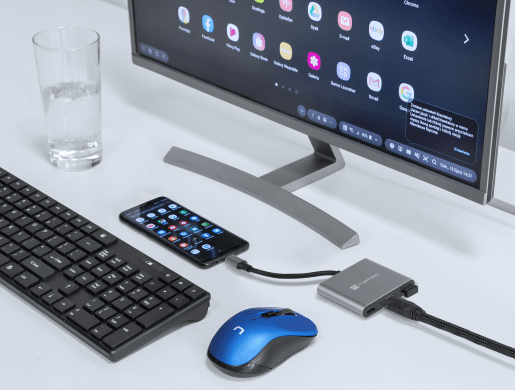
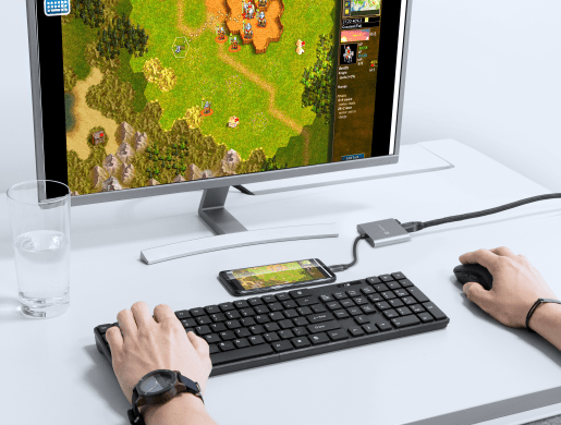
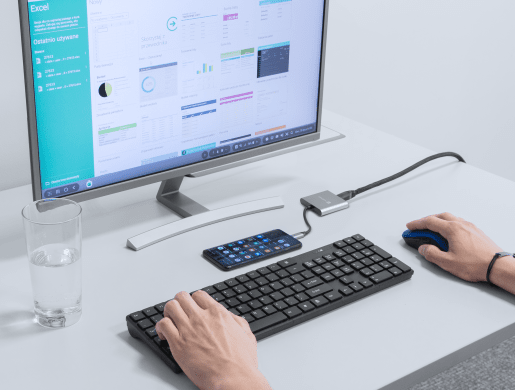
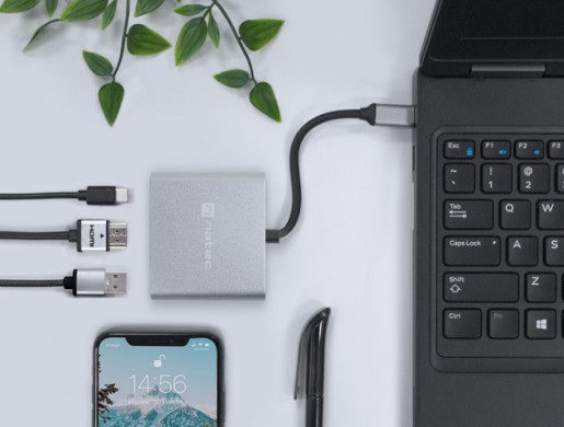
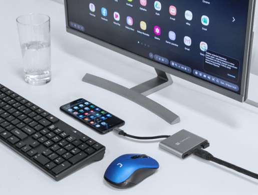
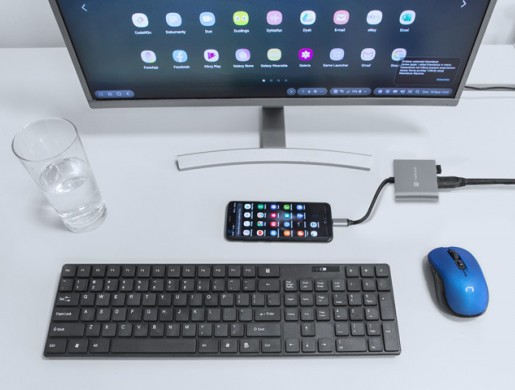
With Fowler Mini, you can fully unleash the potential of your smartphone. For devices that support DEX, Huawei EMUI Dektop or PC Mode technology - you can hook up your mouse, keyboard and use it as a computer.
Using Fowler Mini does not require installation of any drivers or additional software. Simply plug the accessory into your device and the adapter is ready to go.
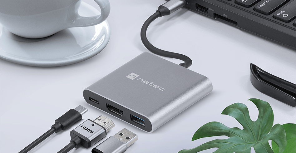
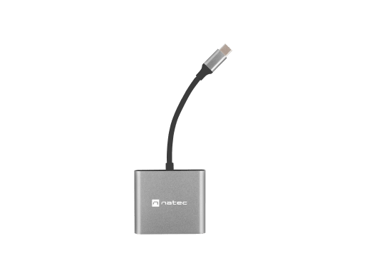
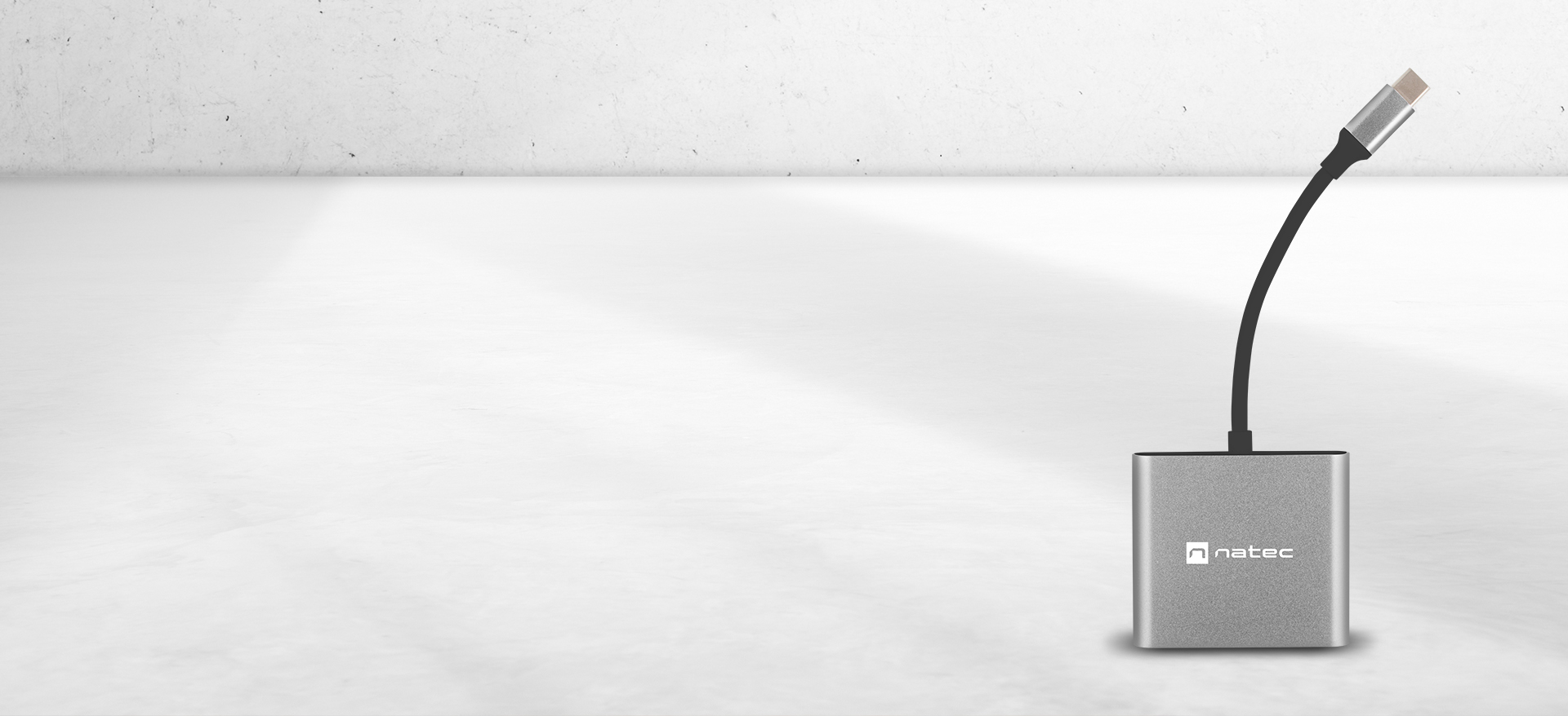
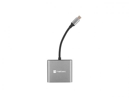
The neat and elegant design of Natec Fowler Mini makes it a subtle addition in any space. Glamorous aluminum and elegant black are the perfect combination that sets it apart and will and delight any user.
| Input port | USB 3.0 Type-C |
| Number of USB Type-A output ports | 1 |
| Number of USB Type-C output ports | 1 |
| Number of output ports supporting video transmissi | 1 |
| USB Version | 3.0 |
| Connectors | HDMI, USB Type-A, USB Type-C |
| Maximum data transfer | 5 Gb/s |
| Transmission speed | 5 Gbit/s |
| Chipset | No |
| Max video resolution | 3840 x 2160 px |
| Image refresh rate | 30 Hz (4K), 60 Hz (Full HD) |
| Active Hub | No |
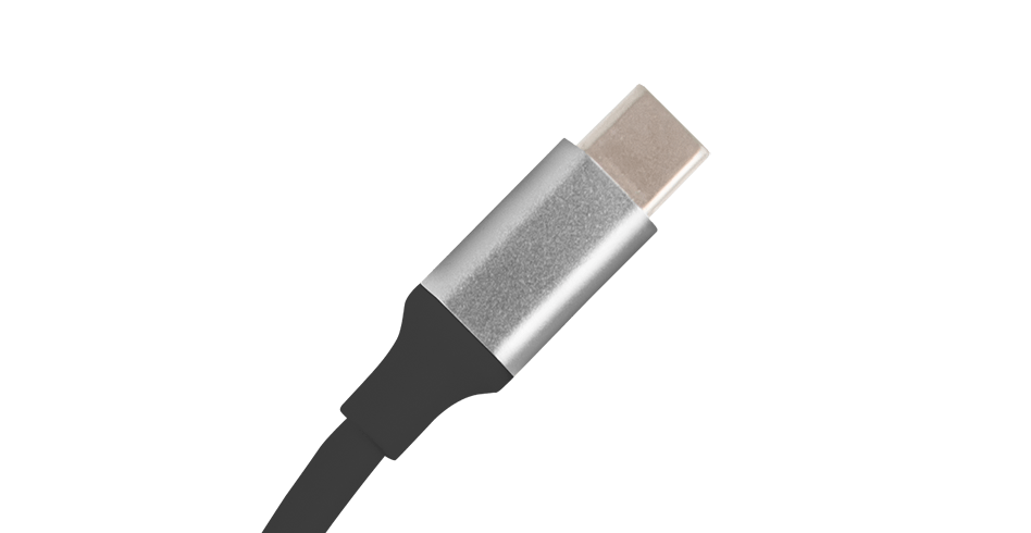
| Assembly of the connector | Nickel |
| Wire braid | Plastic shield |
| Cable length | 11 cm |
| Compatible power supply standard | No |
| Power supply | USB-C |
| Colour | Gray |
| Supported Operating Systems | Android 4.2.2, MAC, Windows 10, Windows 10 64bit, Windows 7, Windows 7 64bit, Windows 8, Windows 8 64bit, Windows Vista, Windows Vista 64bit, Windows XP |
| Length | 59 mm |
| Width | 52 mm |
| Height | 12 mm |


Multiport Hub - Natec Fowler Mini is a product that will allow you to increase the number of ports in your computer. Expand your hardware capabilities with a three port adapter.
